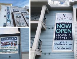
With just a few adjustments, you can compete, grab attention and shine on a limited budget.
With all the new construction quickly popping up around your existing community, how can you compete? Sure you may have less expensive rents, but how can your property outshine the flash of a spanking new community with the latest finishes, cool out of this world amenities and branded welcome gifts. I mean… their marketing budget is a million times yours. It may seem like a losing battle as you rush to get occupancy up before the new competitors open their doors.
Here’s a few tips to help you REFRESH your game on a budget, RETAIN residents, COMPETE with the new guys and look good doing it!
First, get a game plan so you can present the ideas to your owners. Look over the following tips and establish some realistic budgets. Research and shop your new competitors. Use photos, digital ads, websites and other marketing examples. Then summarize what you want to accomplish to compete. There may even be an argument to increase rents with this fresh perspective! How can an owner refuse you? Well, we know extra budgets are often hard to come by, but here’s some ammunition!
••• Freshen Landscaping
Landscaping makes a huge difference and it can quickly enhance your curb appeal by adding lush color and foliage. Look at key entry areas and focal points. Use seasonal color to attract the eye and funnel prospects directly to your door. Adding the right landscaping to your tour corridor will create a warm welcoming vibe while using your mature landscaping to your advantage. Newer communities will sometimes have sparse foliage and smaller starter trees.
••• Paint an Interior Accent Wall
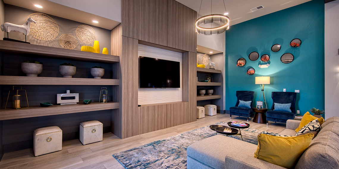
Hire an interior professional to refresh your club and leasing areas with new color and accessories. If you can’t afford new furniture, add a larger flat screen (pricing is a lot lower these days!)… or just add some new pillows for a color pop. Work with your onsite maintenance team to help, and use your painters to repaint a wall with a new brand color. Why not add simple logo letters to that new accent wall?
••• Branding Opps
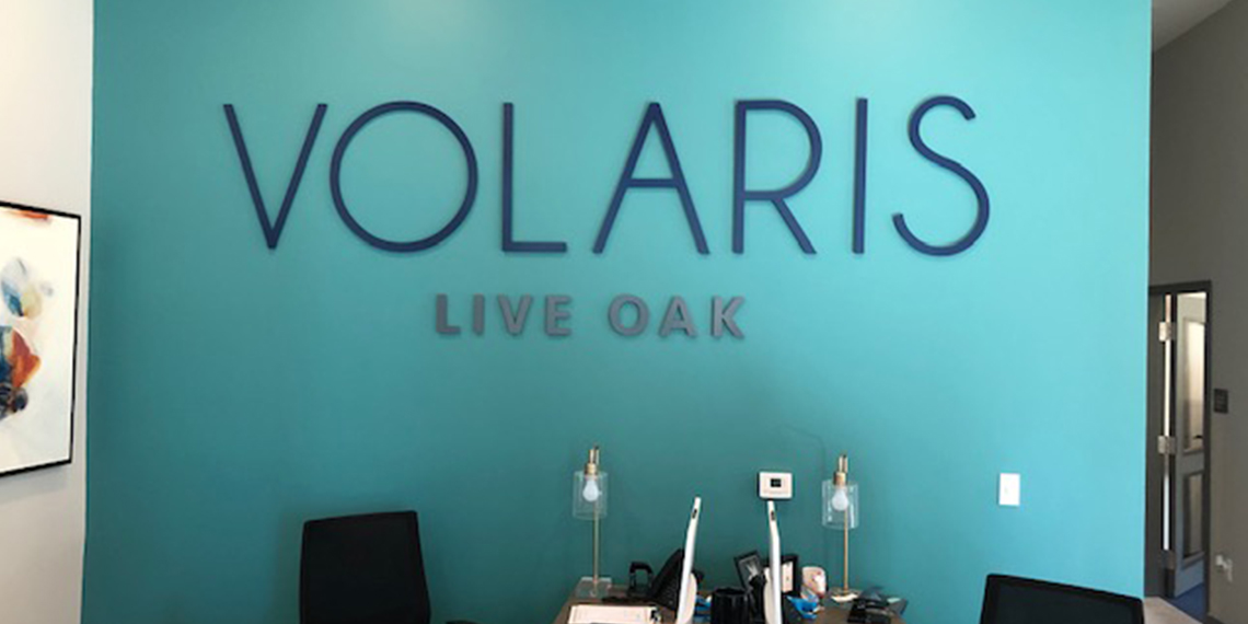
Refresh your brand with color adjustments. Add a slogan to all marketing. But make sure you check out the competition so you stand out. For example, “Life is Better Here” speaks to the consumer who is considering a jump in rent to live at a newer community. Capitalize on what makes you unique. Then find opportunities to brand your community throughout the property. Add a logo to a welcome wall, elevate your slogan with stand-off letters on a key exterior wall. Take patterns and colors and create a large graphic on a fitness wall. Brand work-out towels and add a towel service, offer branded unit welcome mats… Find opportunities to create a story. Your residents will be proud to live there and prospects will be interested in your way of life!
••• Clean It Up!
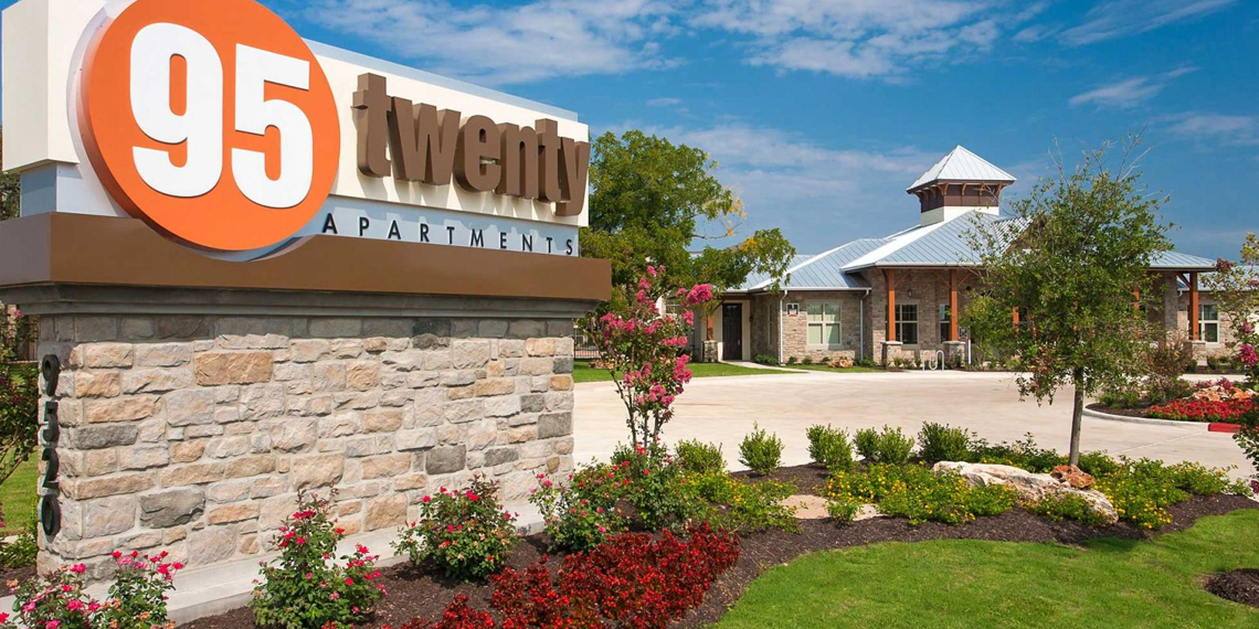
Always ensure your community is squeaky clean. Pick up trash, schedule maintenance to make regular rounds, repaint faded areas, replace rusted fixtures, clean-up trash areas… there’s always something to keep a community looking fresh. But, make it an on-going ritual. Prospects are looking at new properties that are pristine, and you cannot slack off.
••• Paint Your Front Curbs
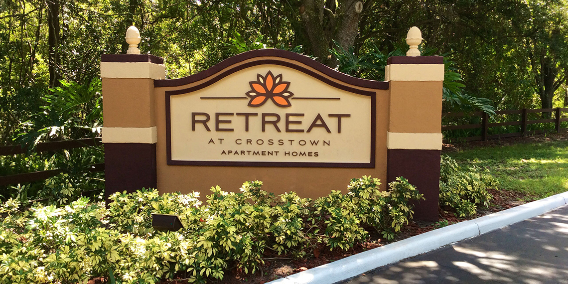
This is a quick and inexpensive option to refresh your entry and make it attractive. Because you may see this area daily, it gets overlooked. Often a fresh coat of paint adds life and that manicured feeling. Believe me, prospects will be looking for any reason to choose new over old. Faded curbs subconsciously says to a consumer, they don’t take care of the community or their residents!
••• Paint Identity Sign & Light Posts
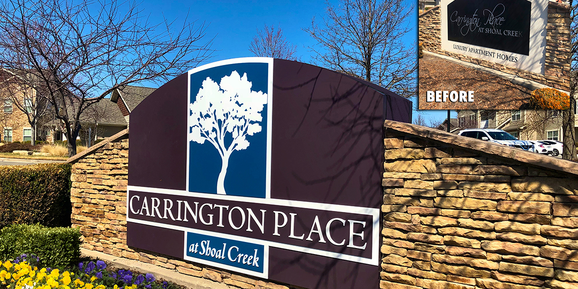
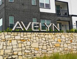
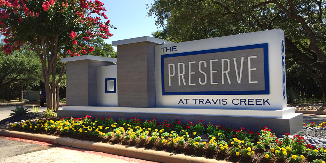
As mentioned, a fresh coat of paint with your new brand colors does wonders. So have maintenance wash down your monument with a hose (watch pressure as old paint could quickly chip away). Or repaint older oxidized colors. Contact exposure to the elements or even stray irrigation can fade a monument, create hard water deposits, unsightly fading and paint issues. Your identity is usually their first impression. Ensure it looks great 24/7 and read our previous blog on sign tips!
••• Add Flower Pots with Irrigation
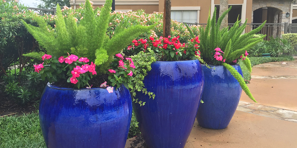
Flowerpots can add color and excitement to a hardscaped area. Select different shaped pots and sizes, group them in threes and add consistently colored foliage. Coordinate with your landscape professional on what type of plants are best. Use a variety to add some excitement. Also use a central color theme on the pots. These will add life to a pool, call attention to your leasing entrance or club and welcome prospects. Ensure irrigation is extended from existing areas so pots remain watered through the harshest of summers and pots always look beautiful.
••• Restripe Parking Lot
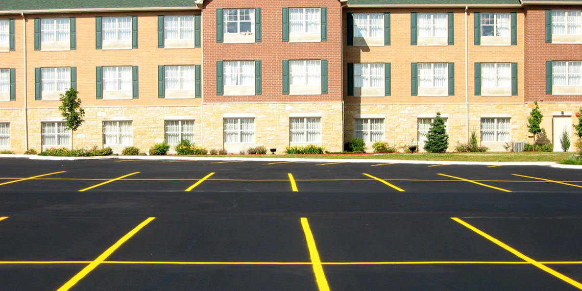
Resurfacing and restriping a parking lot can get expensive but it will feel new and even existing residents will appreciate the effort. Repair potholes and unsightly oil spots. You may even consider adding an entry paver strip. When prospects arrive, the feel of riding over pavers means they have arrived at their destination.
••• Clean Up Mail Center
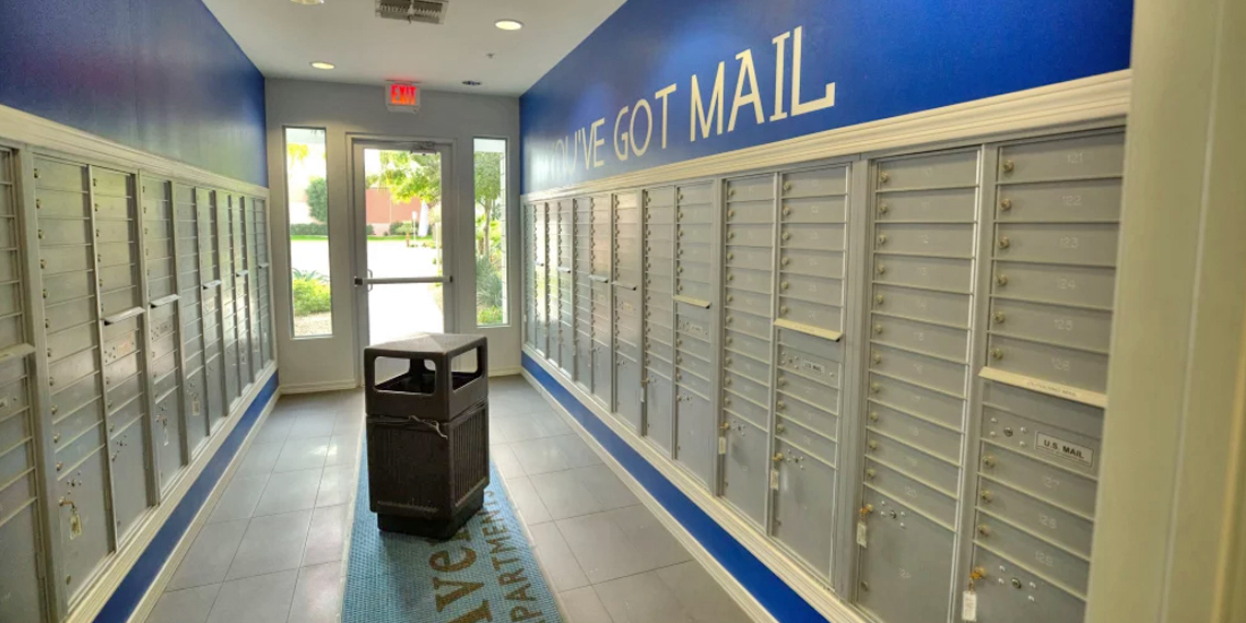
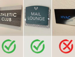
Many communities don’t realize their residents frequent The Mail Center on a daily basis. Keep this area clean and refreshed. Add branding, flowerpots, color or even additional landscaping as a constant reminder that you care. Look into delivery lockers. Every new community will incorporate Amazon or other branded lockers. This is a huge amenity that residents appreciate with increasing home deliveries and grocery services. There are new options almost daily as this service is expected. In addition, replace tired trash bins throughout your community.
••• Add Balloons & Feather Flags
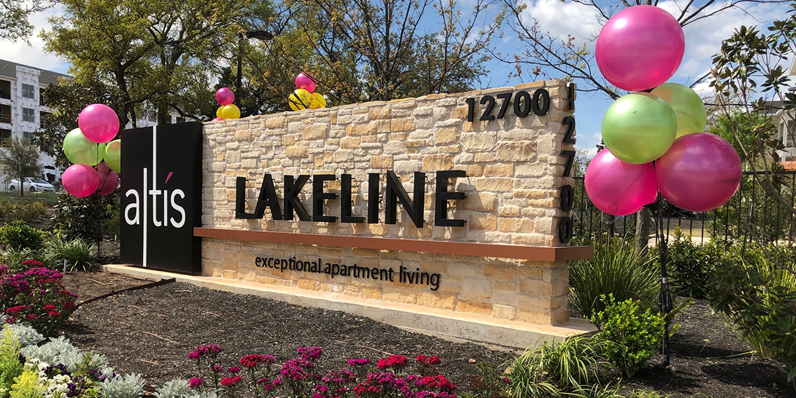
One of the quickest and easiest ways to call attention to your property is to take advantage of color and motion with the latest crop of temporary marketing. Air-filled balloon clusters move and look like real balloons without the hassle or helium expense. They last for months and never look deflated! Change out colors for holidays and seasons or utilize your brand colors. Supplement with feather flags or customize the new spinning flags that include balloons. We recommend BalloonsOnAStick.com for a variety of products and options. These handy products liven up your curb appeal, attract attention and you can position them to guide prospects directly to your door. Residents also will appreciate the fun and celebrate with you on holidays and events.
••• Refresh Your Logo/Monument
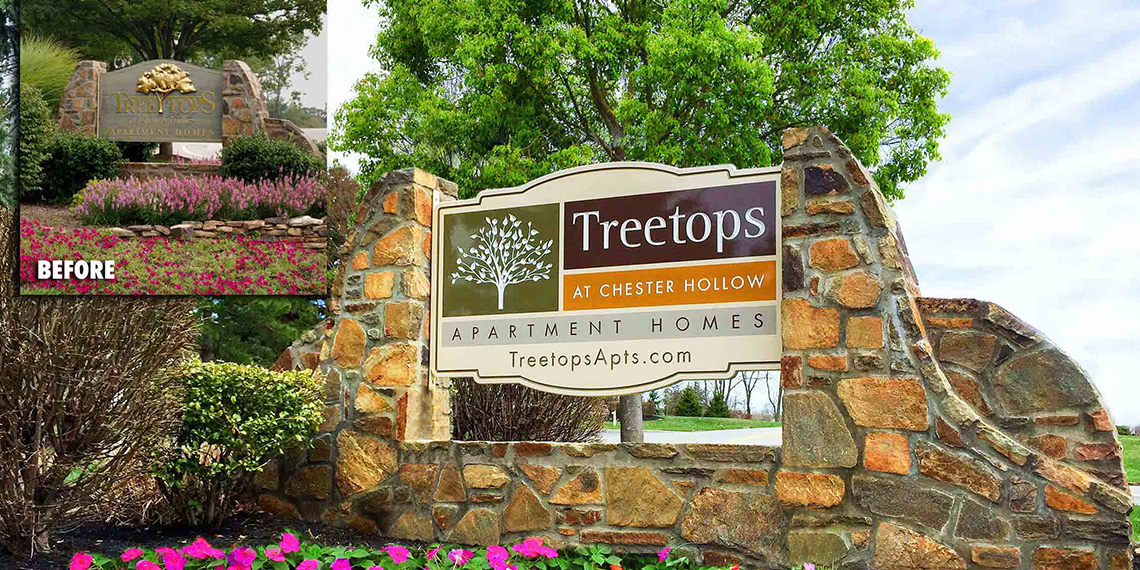
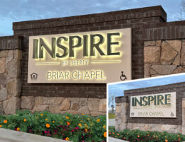
We mentioned how important your entry and identity is to a potential resident. But consider updating your logo. If your property is more than 7 years old, you probably need to update or freshen your logo. Remember you’re competing with new construction AND their branding budgets! There are added expenses to changing a logo as you may have to replace it on your print, website and social media. However, it gives your community a revised attitude and new perspective. A dated logo Is just that. It screams, “We are an old property that doesn’t keep up with the times!” Maybe you add an icon to your current typeface with new colors. Even better… Add an illuminated plaque with your new logo to capture more prospects 24/7! See us for help. We’ve transformed older communities with dynamic new signage on a budget!
••• New Print Tools
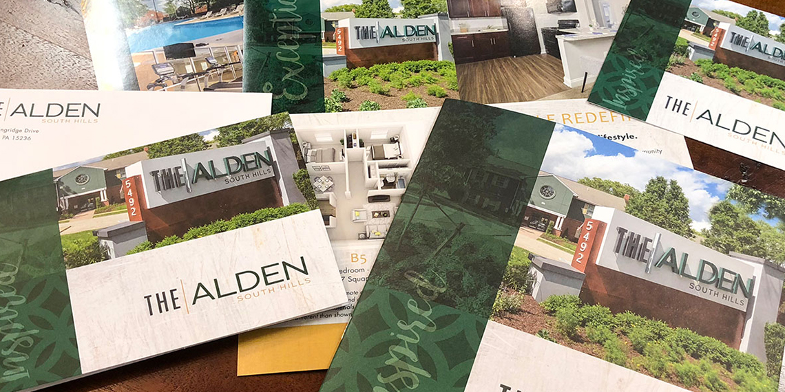
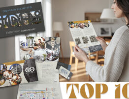
Update your print tools with new brand colors and graphics. Most new communities may be completely digital. It may seem cool but it comes off as cold and impersonal. Handing a prospect a branded brochure tells your story, provides a tangible visual portfolio and becomes a welcomed, appreciated signature statement. At the end of the day, they’ll remember your community over the new property that simply emailed them a floor plan. You’ll stand out from the competition and they’ll appreciate it. We recommend DesignPrintStudio.com. We created this system for an affordable option to branding and print. There’s 22 themes that are Brand On Demand without the cost and headache of new customized branding. You can use your custom colors or save even more by using established color palette options. It’s designed exclusively for multifamily and we’ve incorporated our expertise into a huge variety of print tools. You can even continue the brand through Design Studio websites and community signage at a fraction of the cost!
••• Beef Up Social Media

Take your refreshed brand to the streets with social media. Change your logo and brand colors on all digital platforms, add new banner graphics and refresh antiquated post art. This is a great place to expand your new brand refresh. Set up a schedule to post regularly and at least twice a week. Encourage residents to like your pages and follow you for exciting tips, events and community engagement. Take it seriously. Social media must be massaged and fed to create solid consistent activity.

