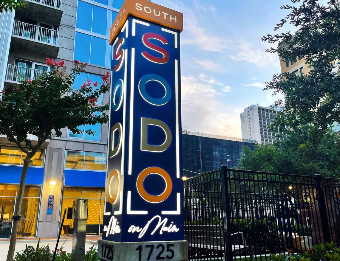
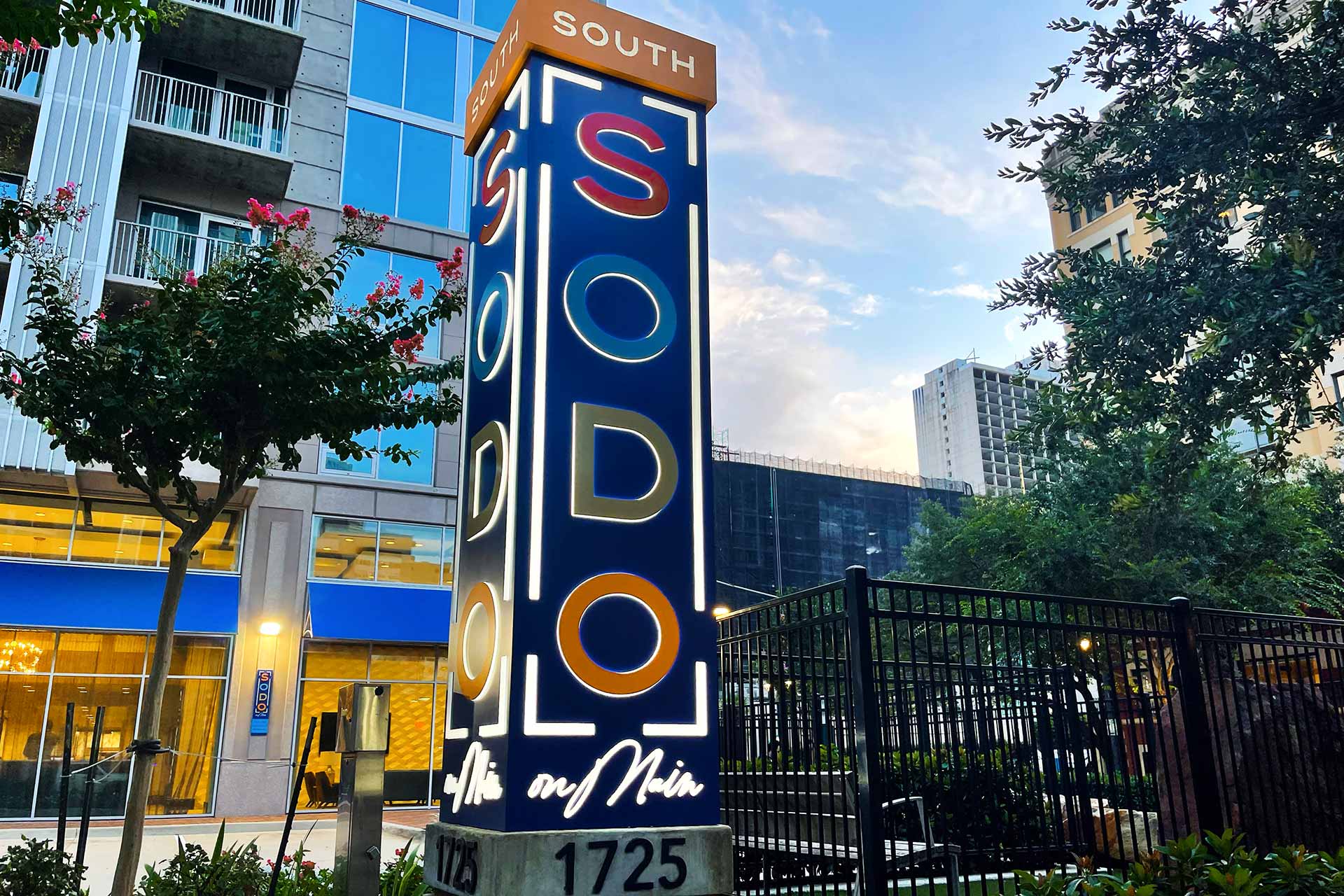
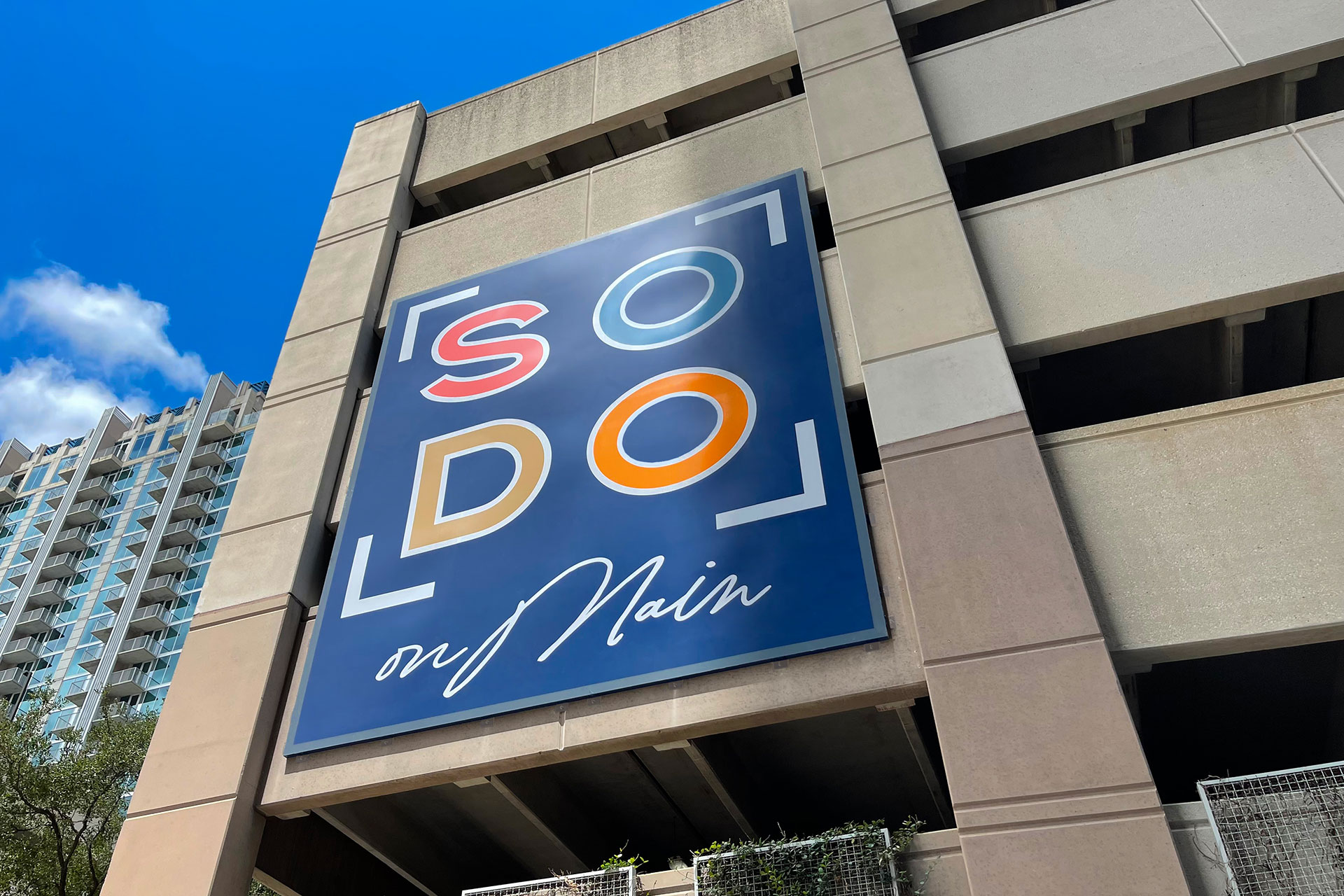
Bold Downtown Refresh
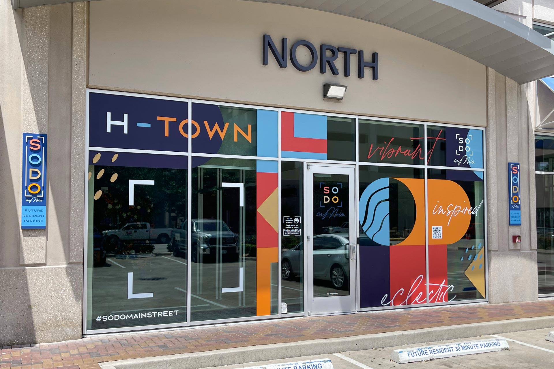
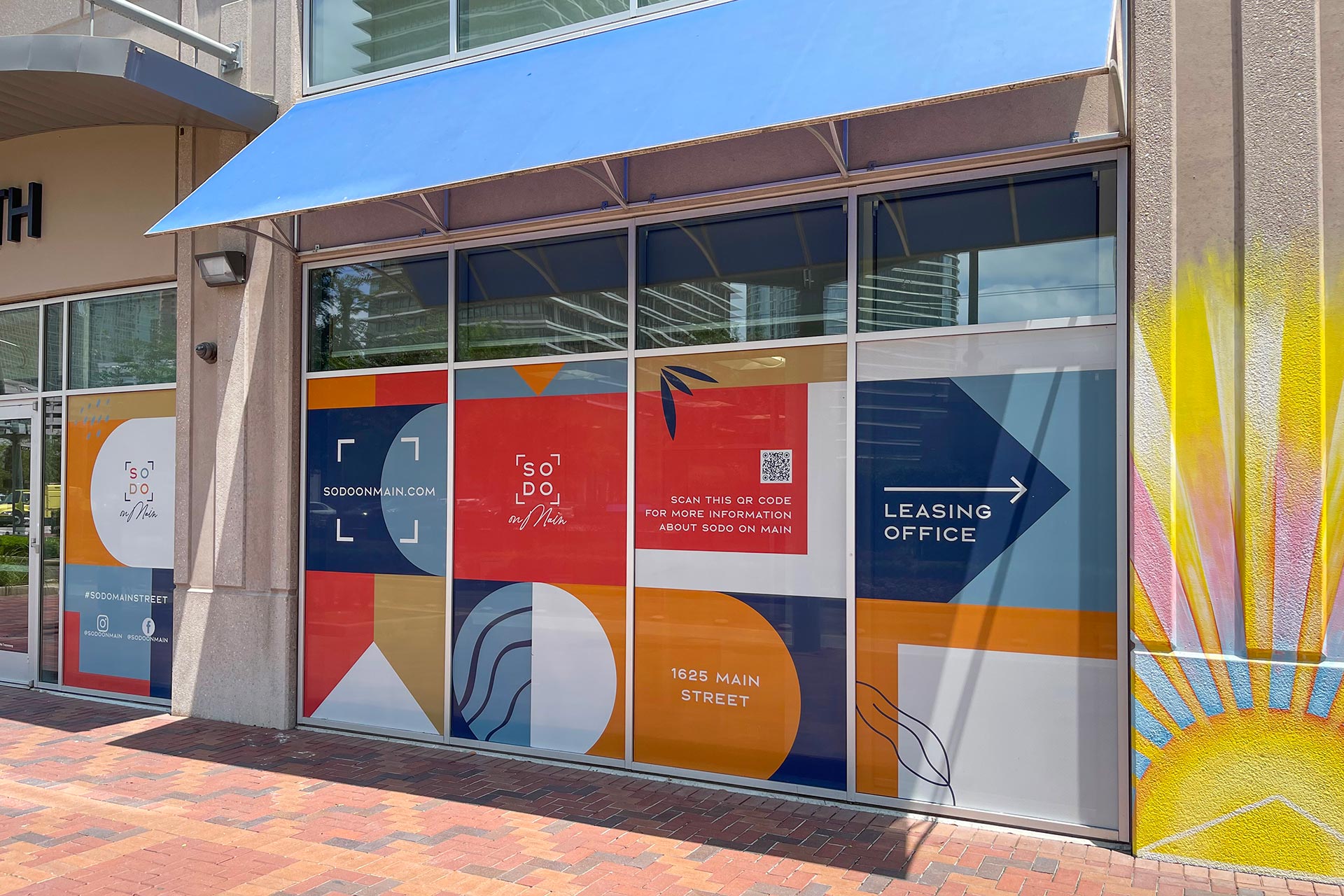
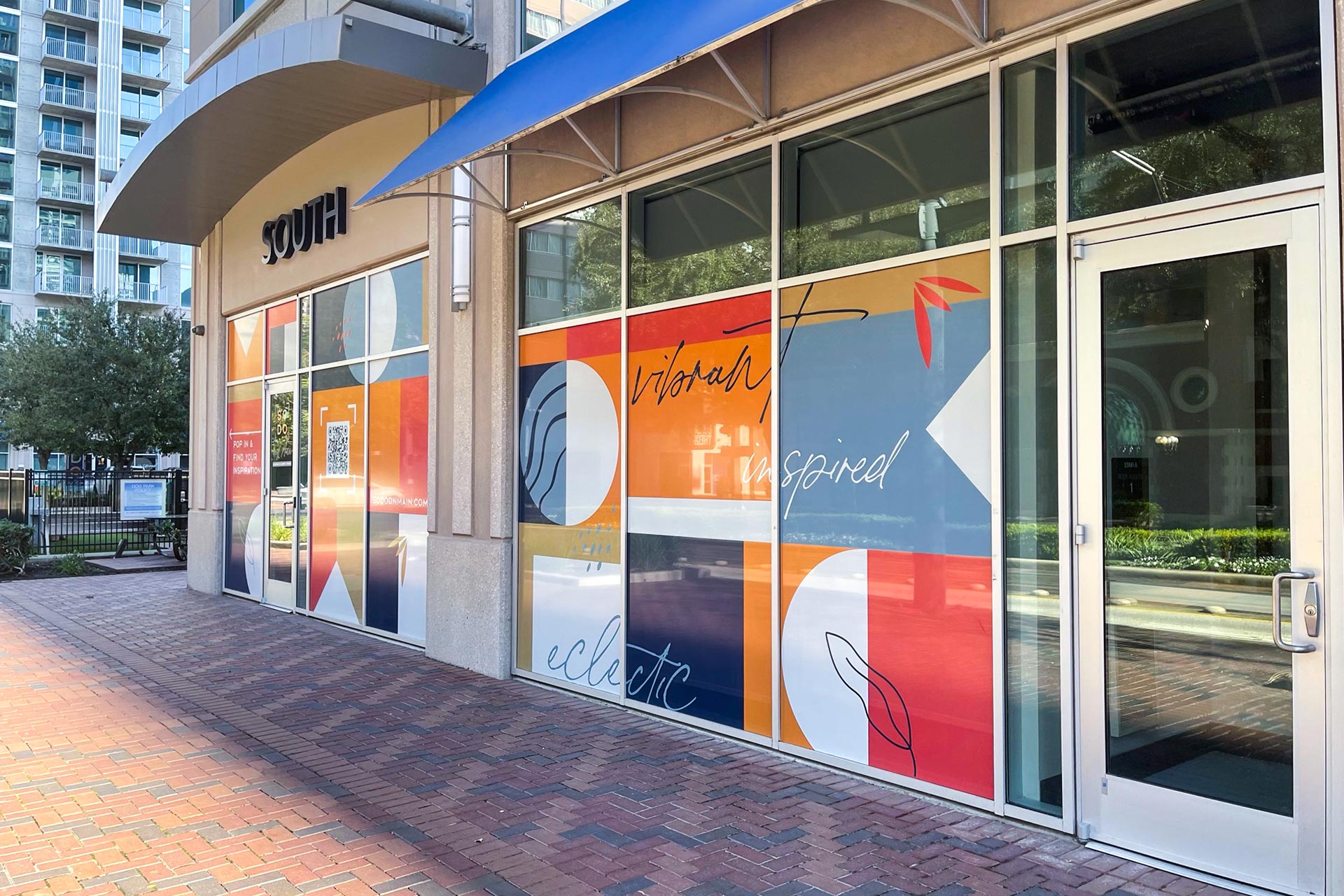
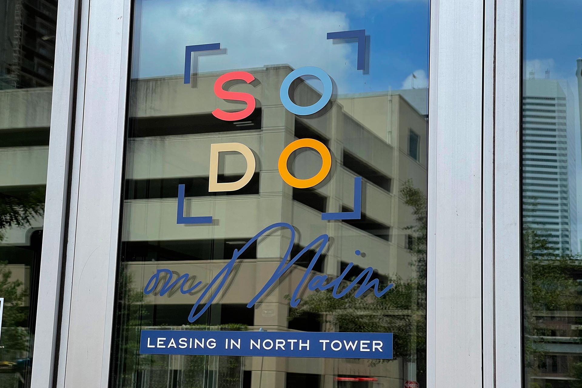
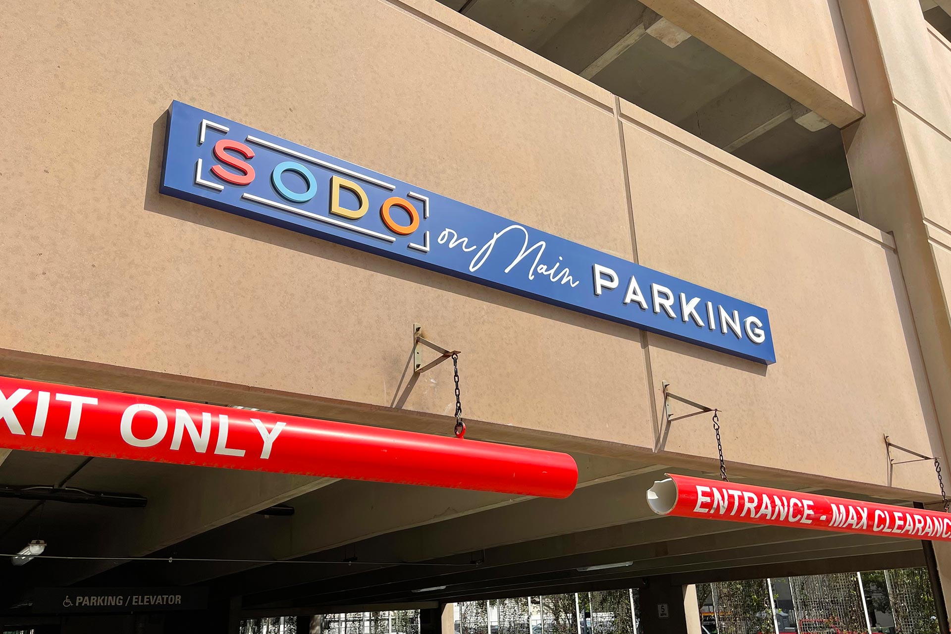
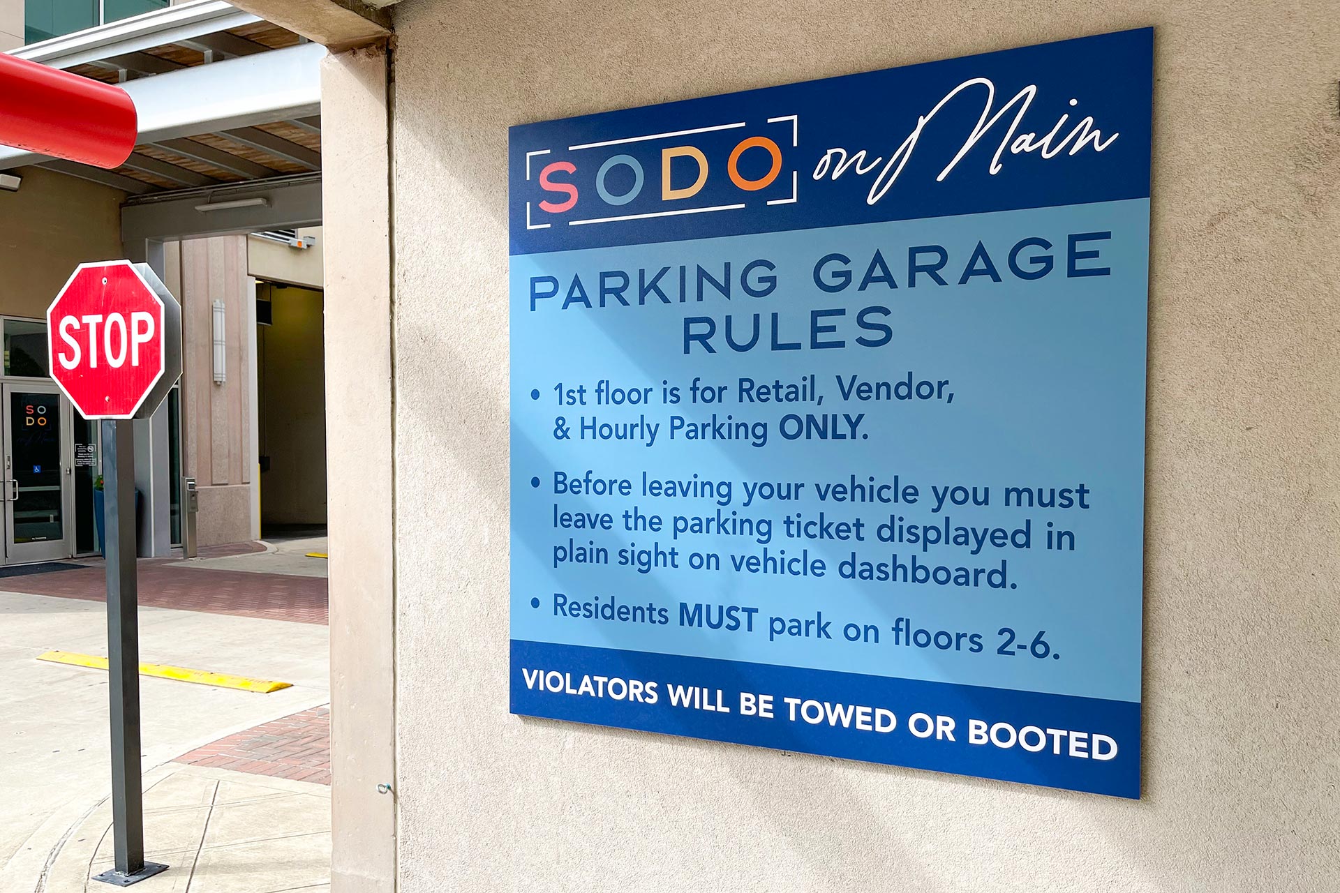
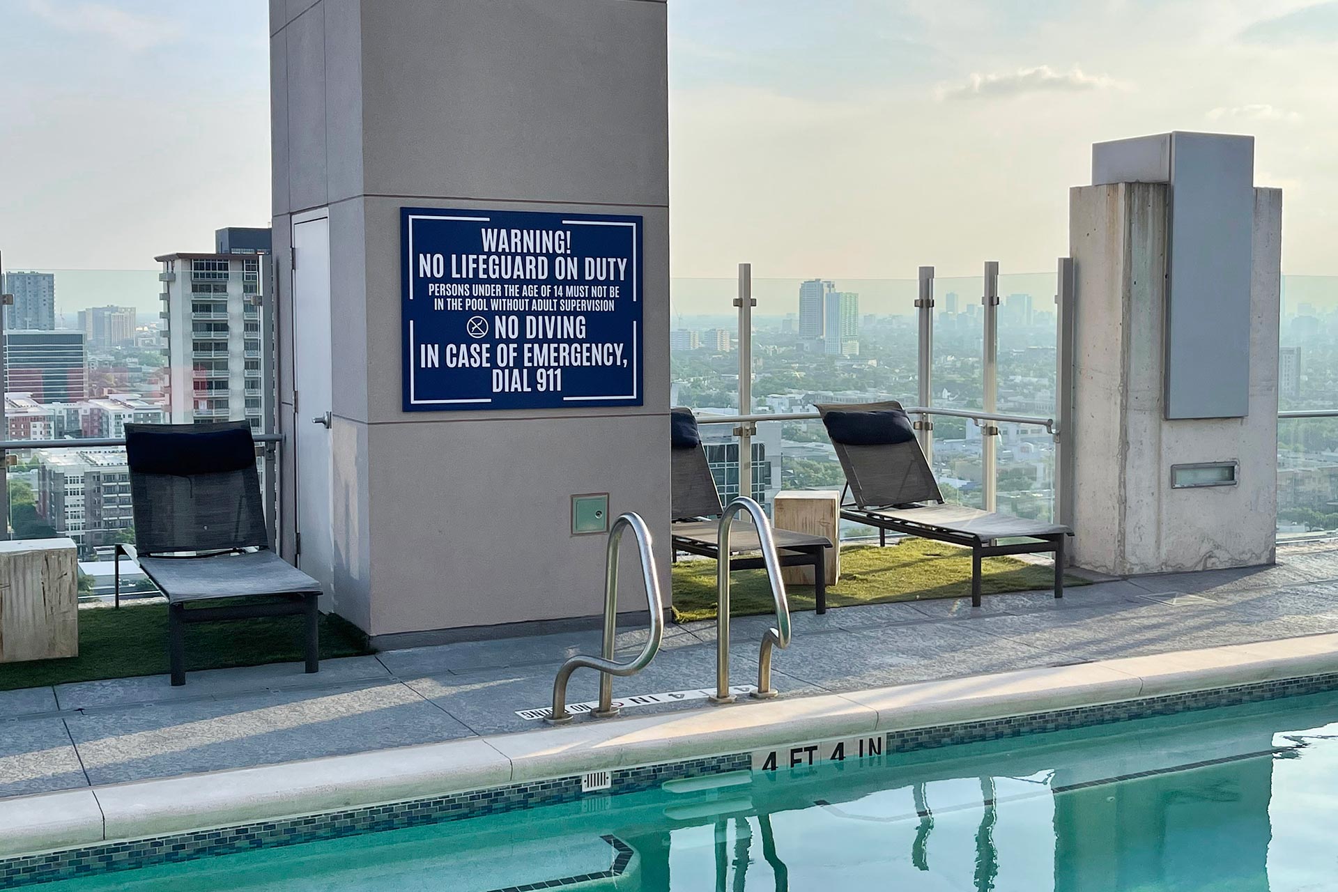
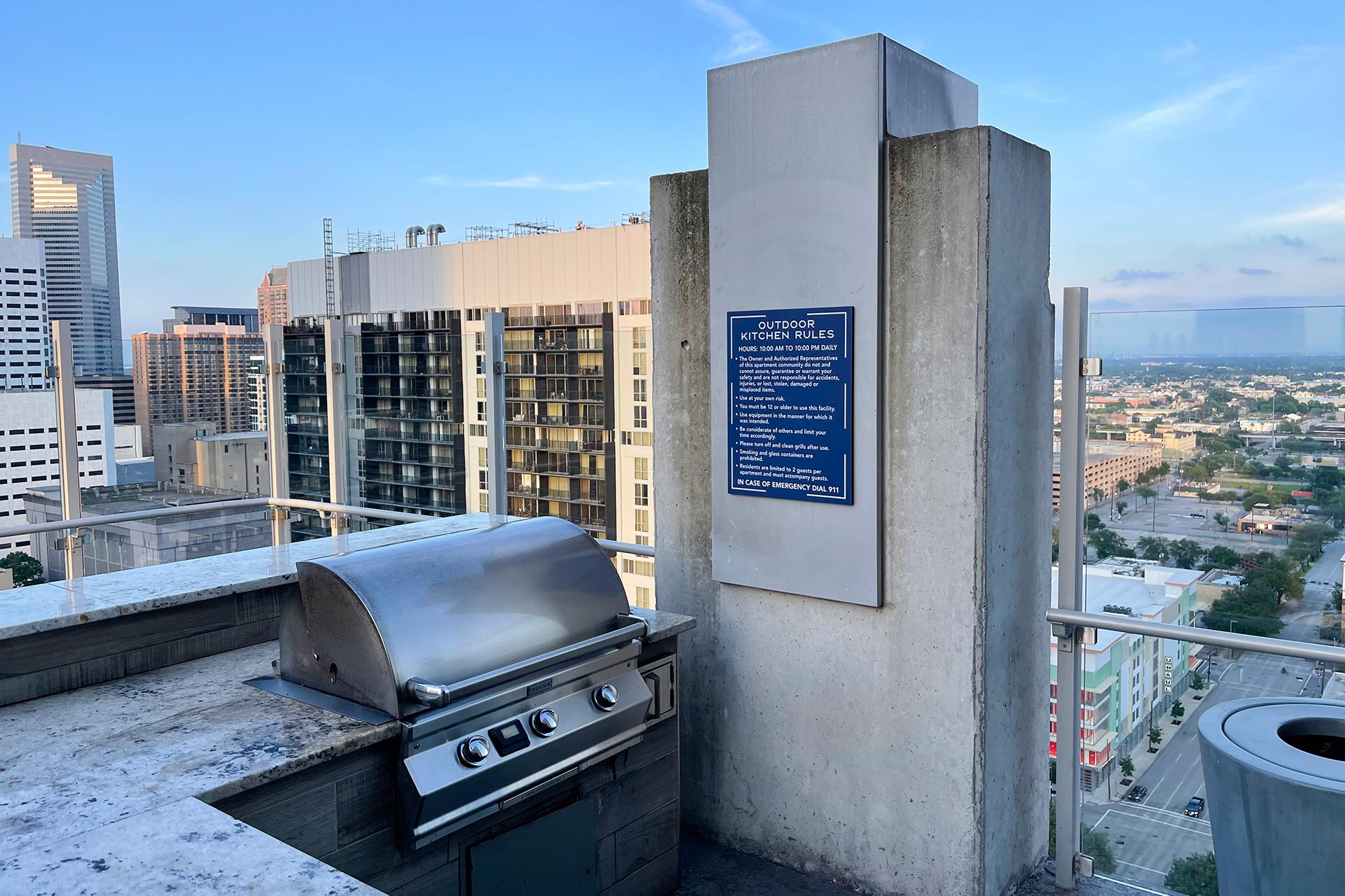
SODO is a repositioned twin-tower residential urban community in bustling Houston. The remarkable buildings are only a few years old and offer uptown high-rise living to Houstonians desiring a downtown address. It features striking homes with a bevy of onsite amenities between the towers and breath-taking views with sky lounges and pool decks on each of the towers’ 24th floors. Each tower takes up its own city block with onsite garages.
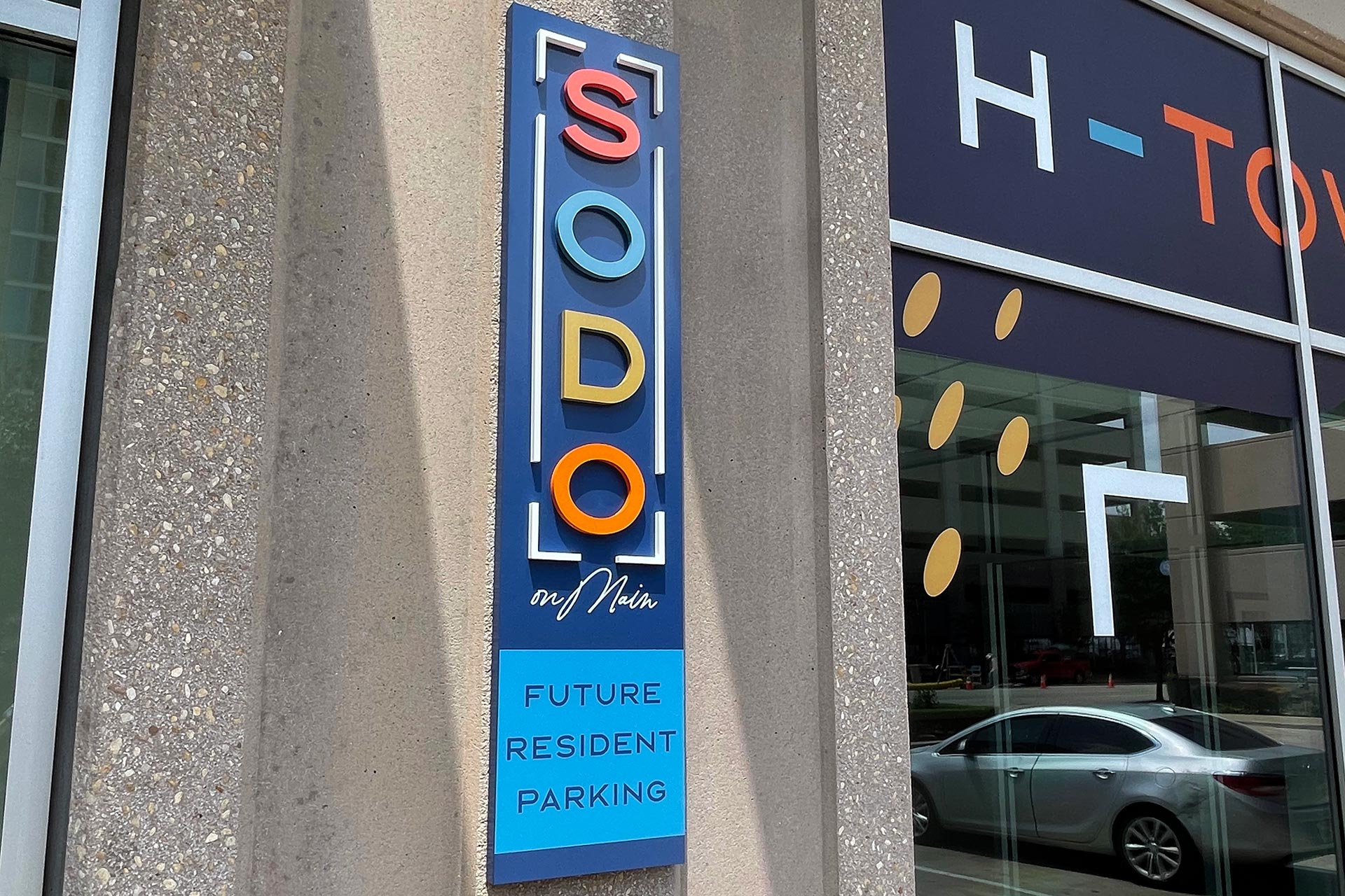
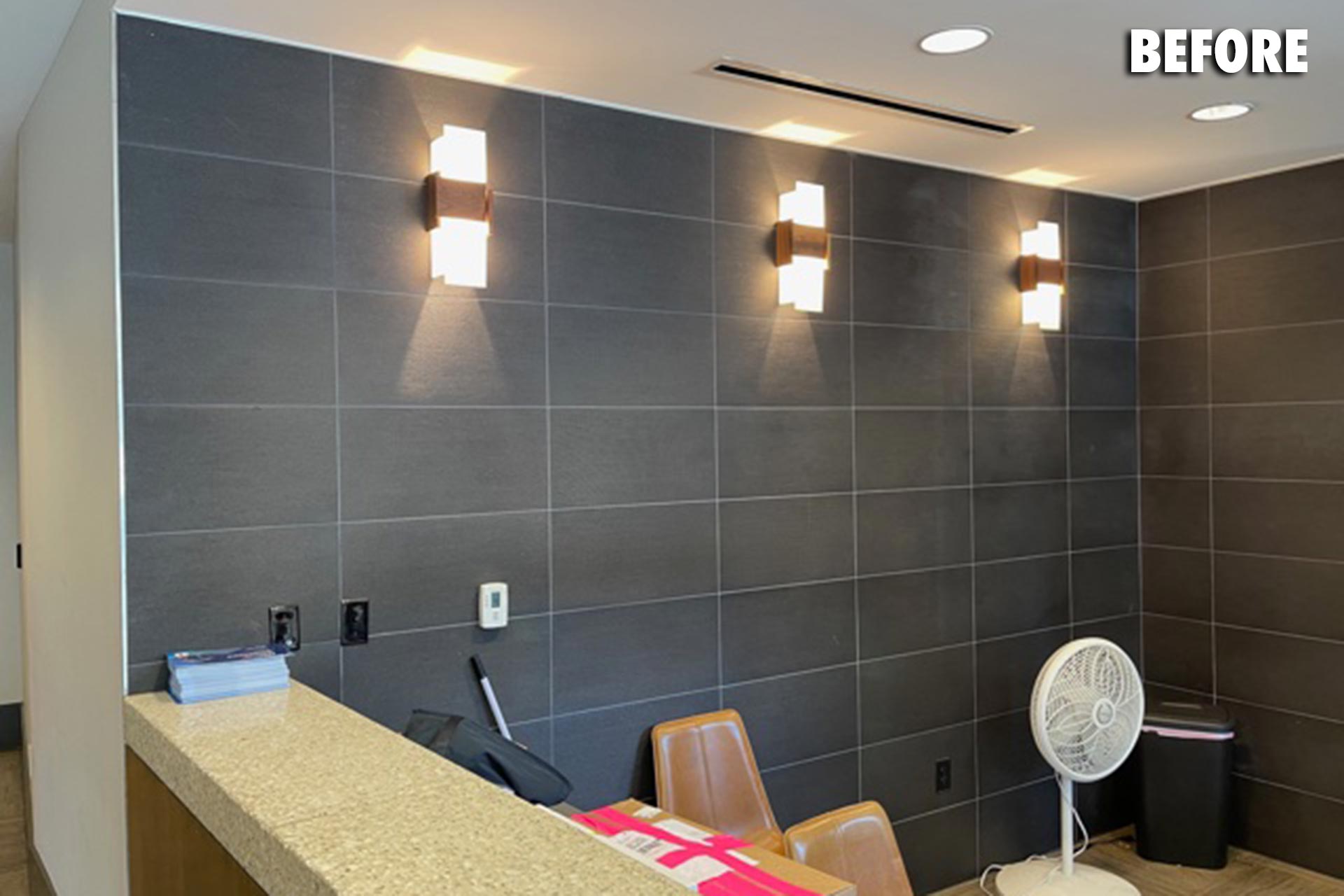
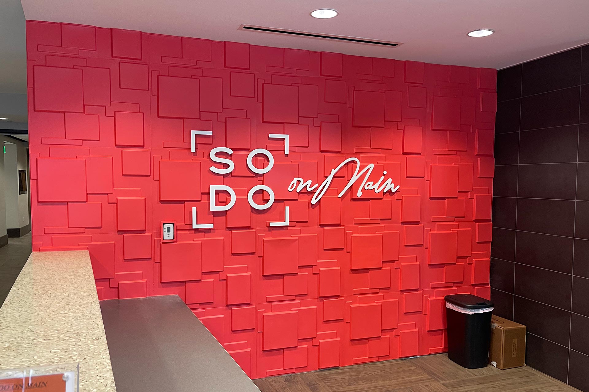
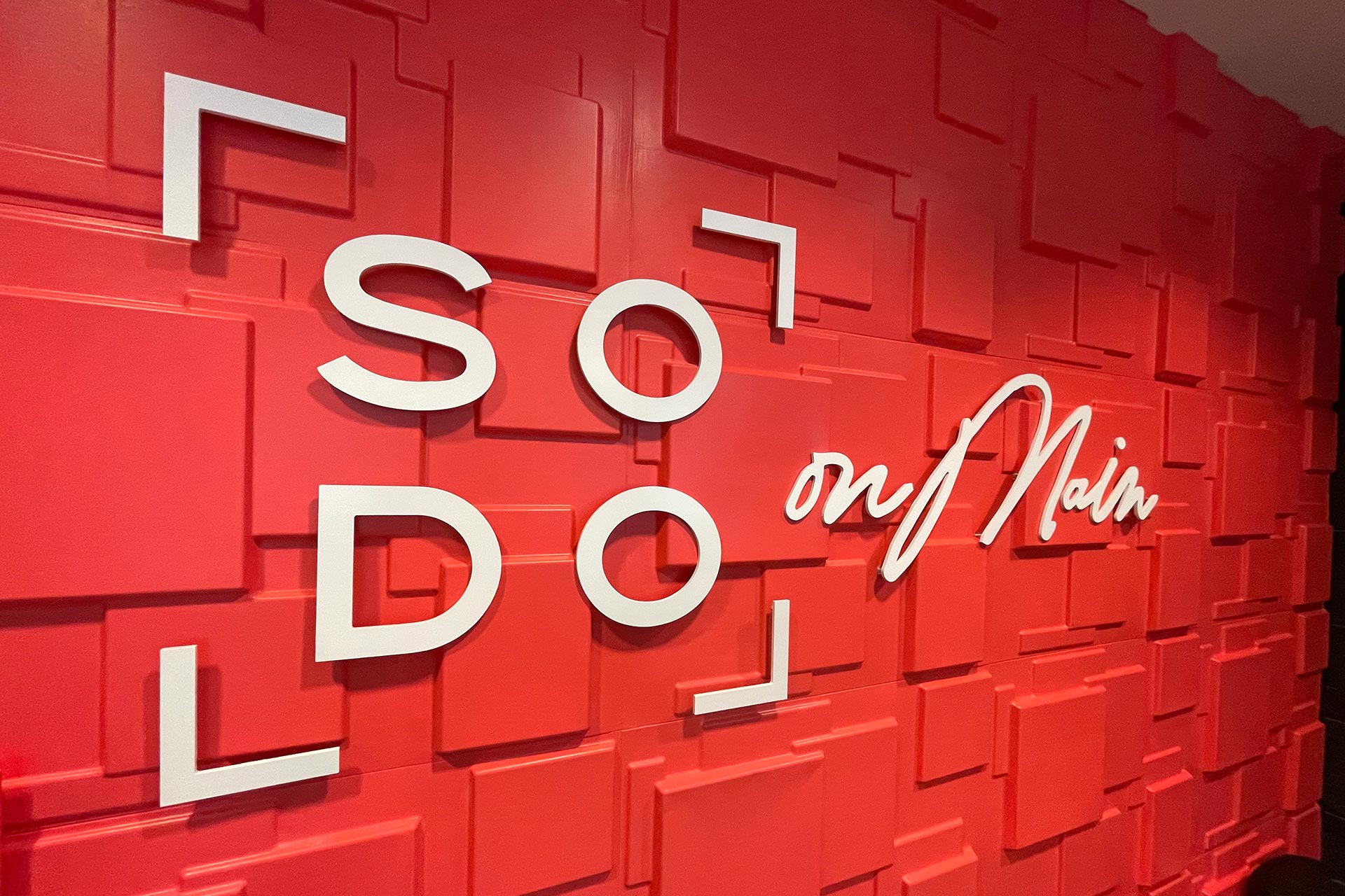
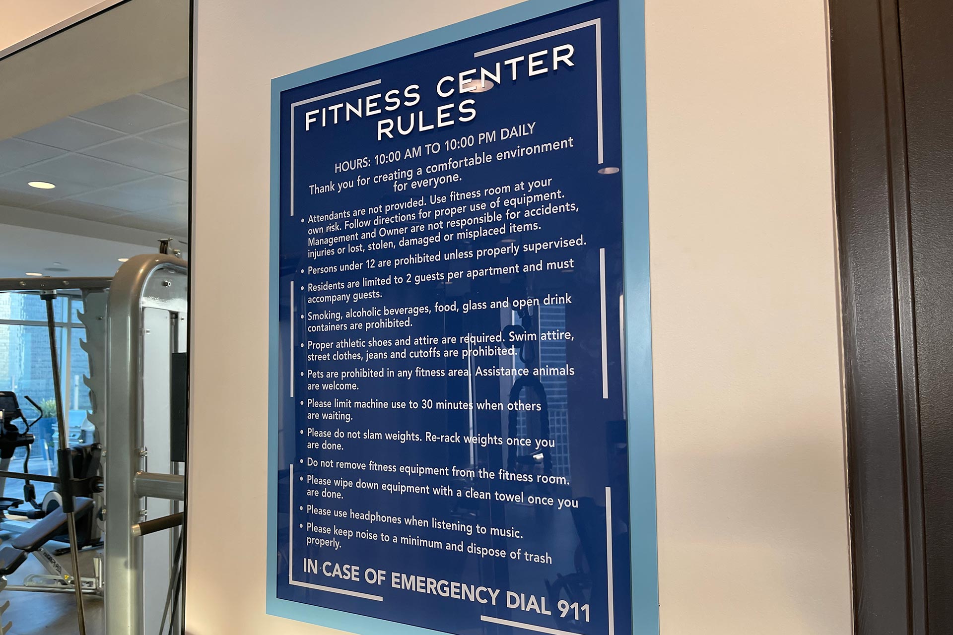
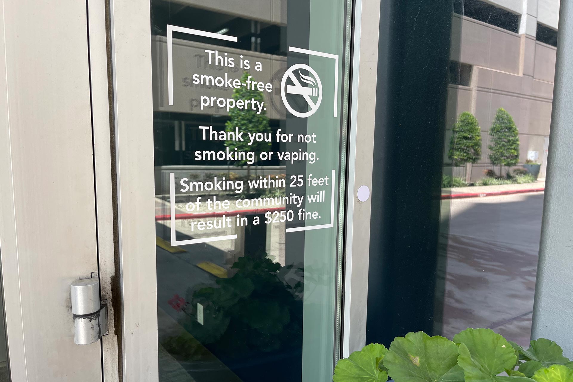
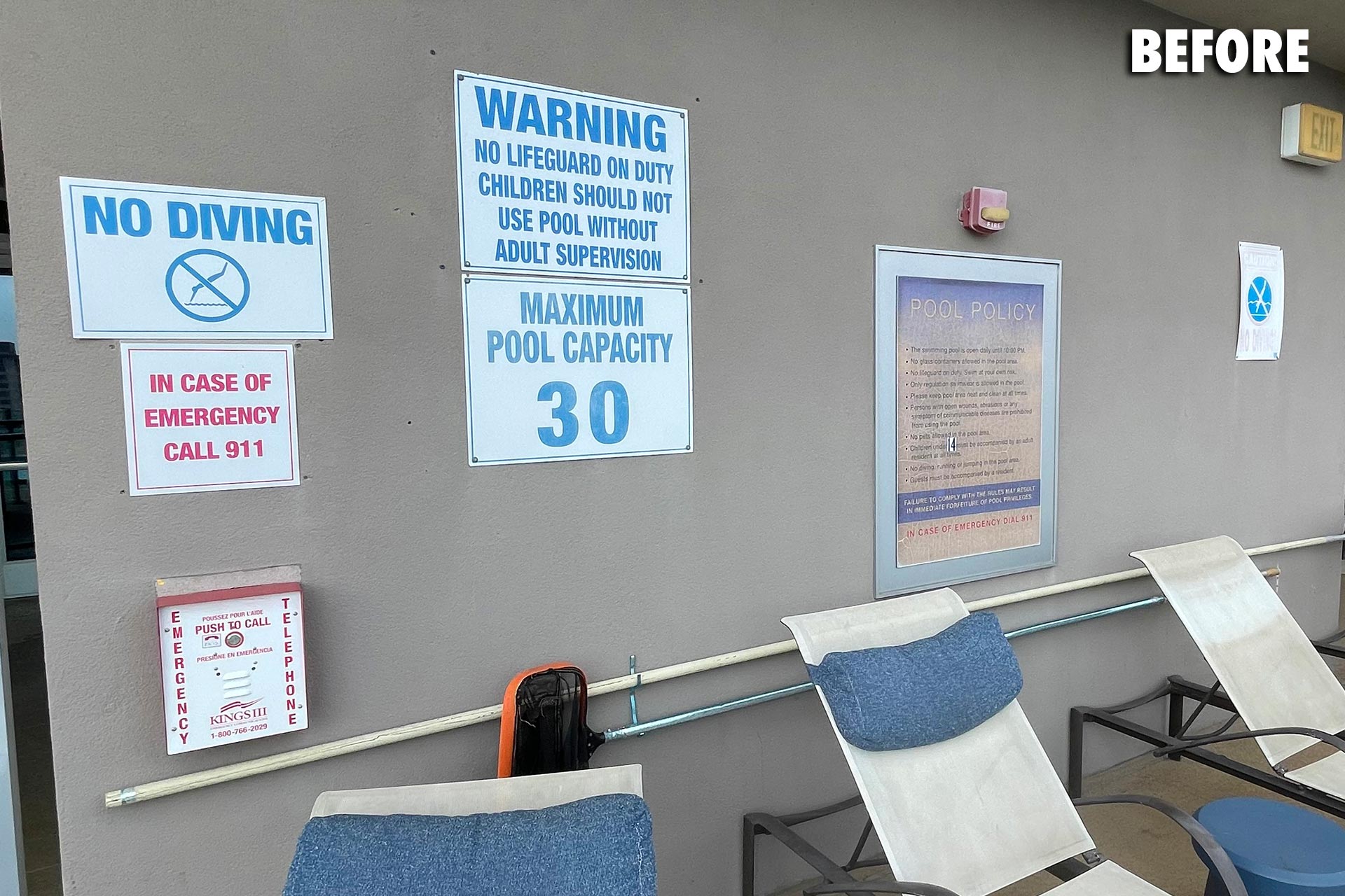
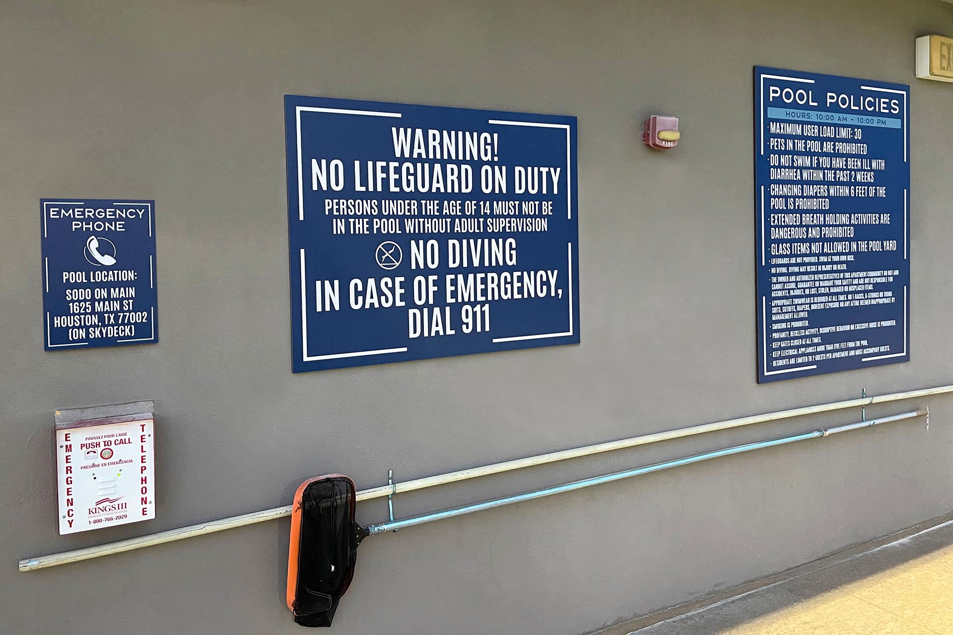
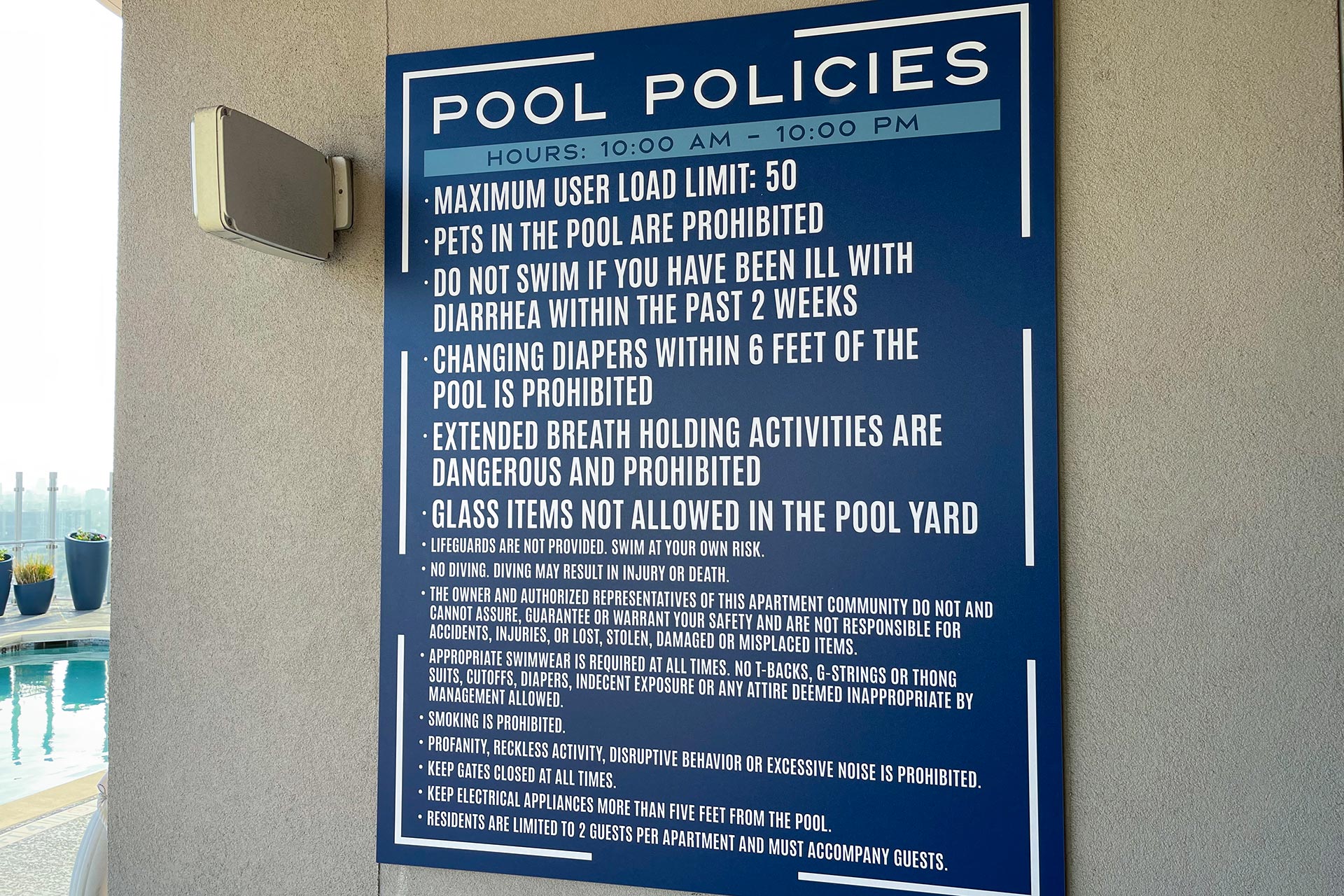
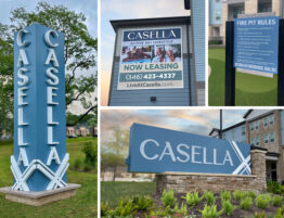
This commanding community demands a bold approach to its market with impacting colors and geometric shapes. During the naming transition, RC establishes temporary identity signage and vivid window graphics. As the project develops, and City permits are established, RC creates a community sign package that carries the brand throughout the buildings while refreshing older, dated signs. Larger more prominent identity signs are designed to better direct and inform street traffic. Other signs are added to expand brand awareness, impact, and wayfinding. The strategy proves most effective by also adding an extraordinary concierge dimensional wall with a signature logo.


