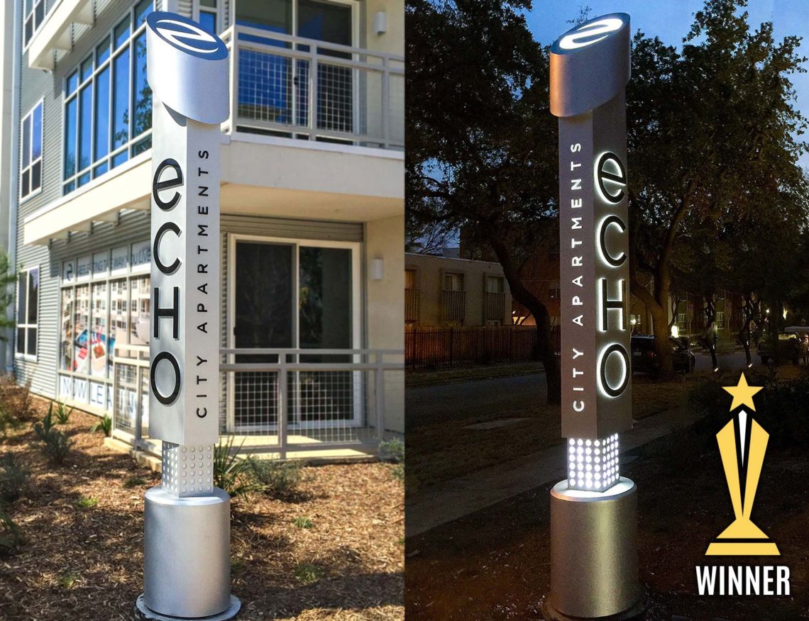
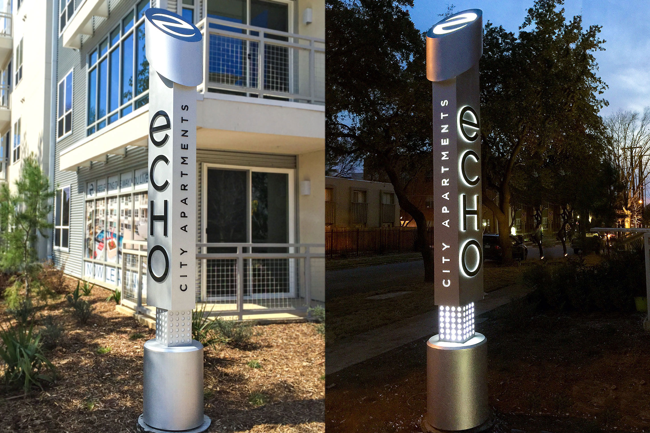
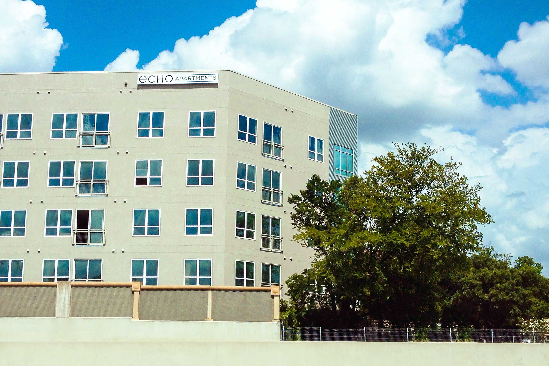
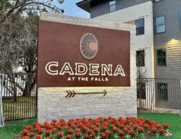
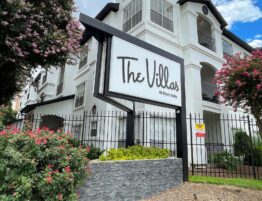
An Innovative In-Town Mid-Rise Identity & Sign Campaign.
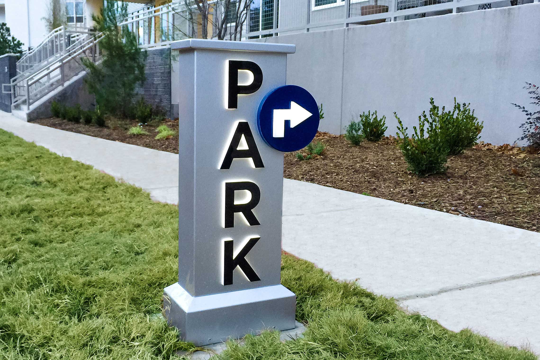
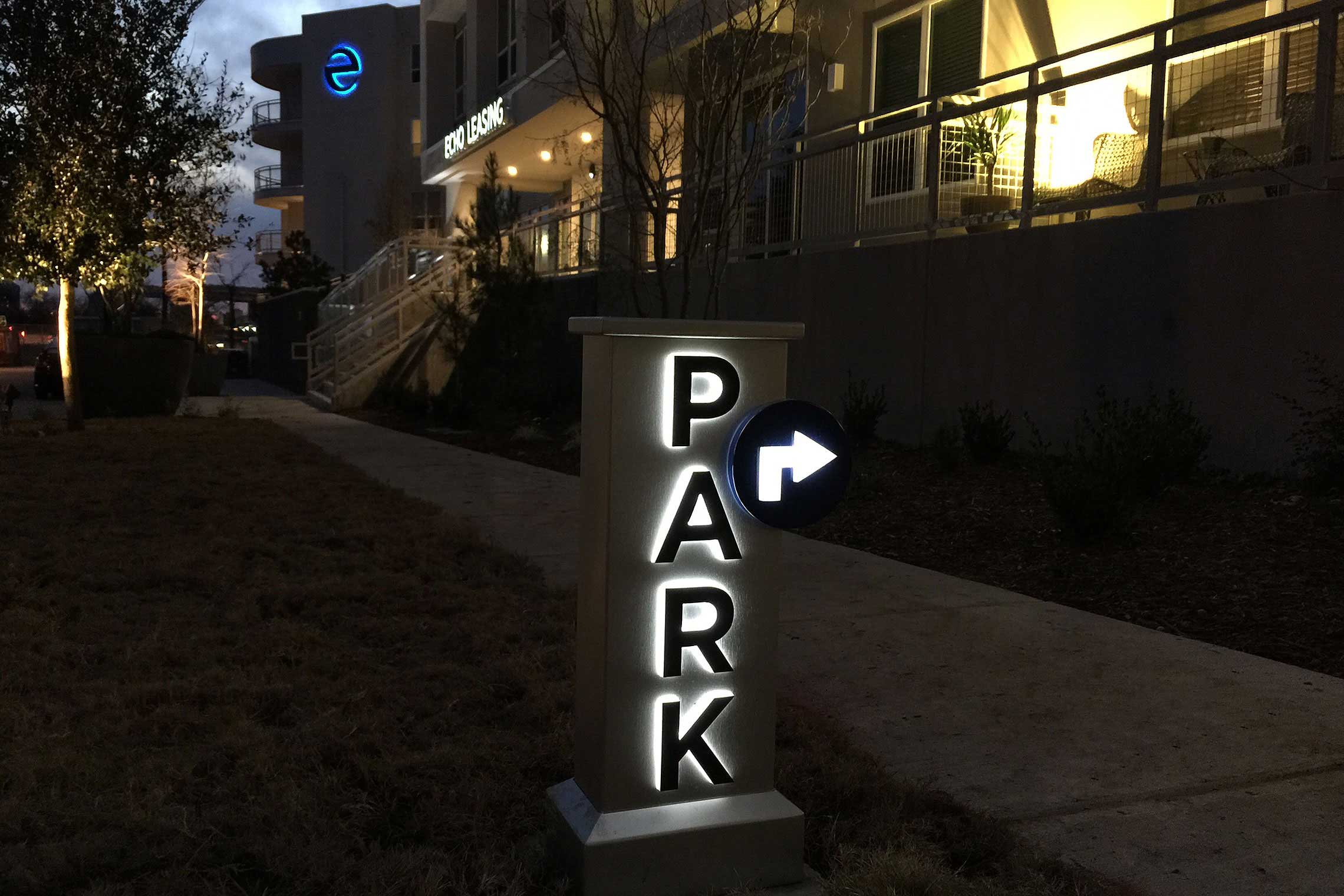
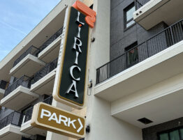
This hi-tech, ingenious architecture style and progressive vibe needs an equally dynamic identity and signage system. Geometrics, materials and look are crucial here. Due to strict sign codes combined with tight areas, a striking vertical pylon design is introduced. This “ground blade” design allows the identity to position itself as close to the traffic as possible. Brushed aluminum with captivating lighting techniques, this identity attracts attention 24/7 while powerfully introducing the community.
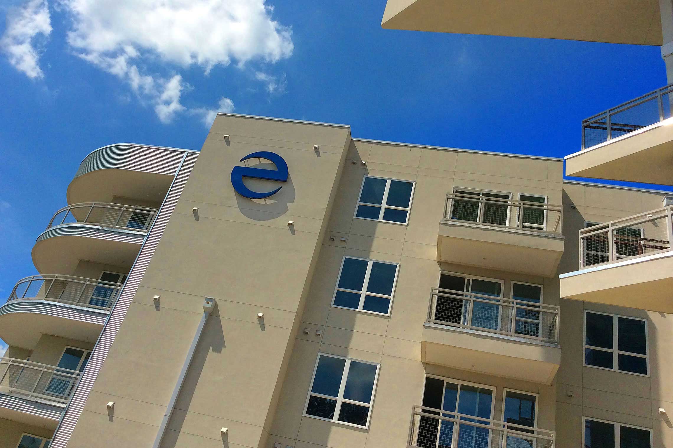
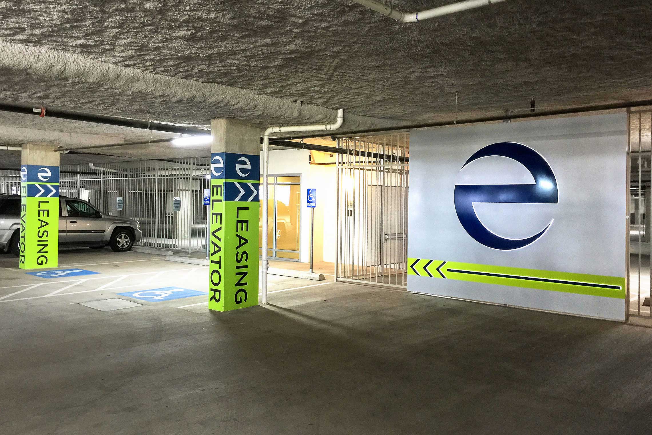
Faces are edge-lit and brilliantly angled toward traffic for optimum views. The “e” icon is presented at the top of the pylon design.
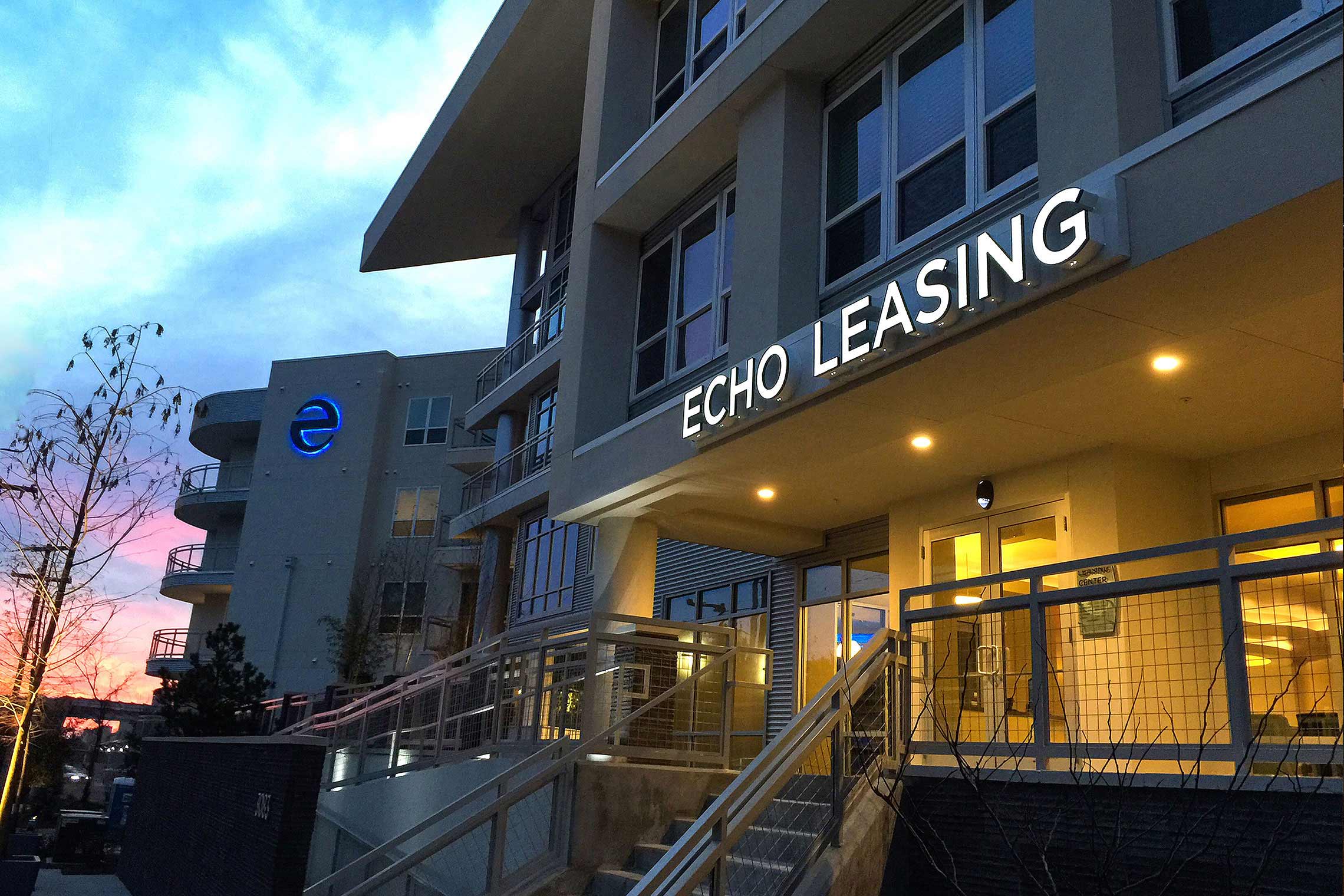
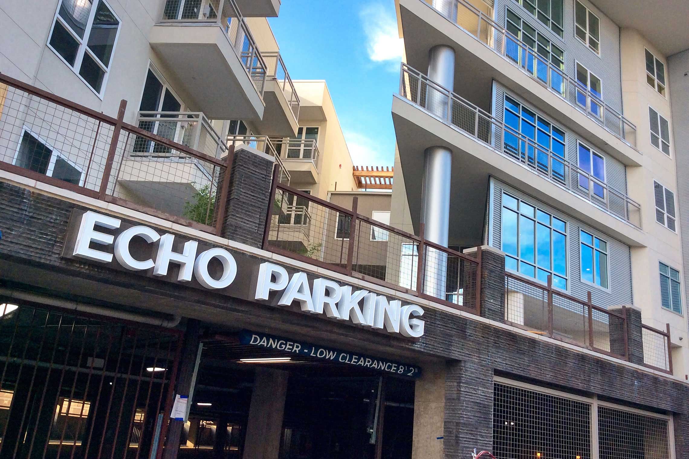
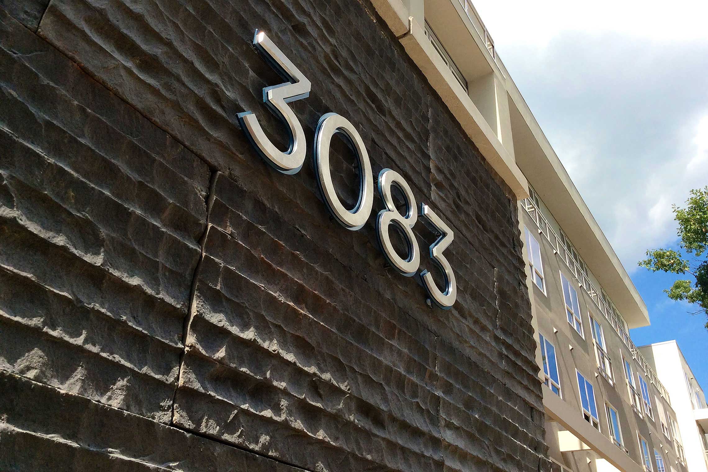
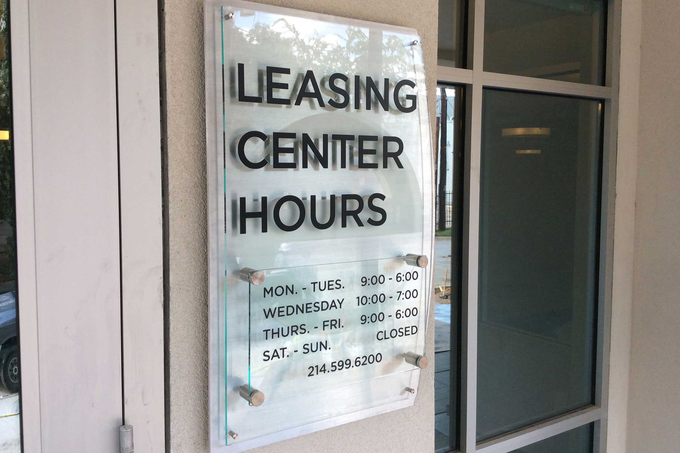
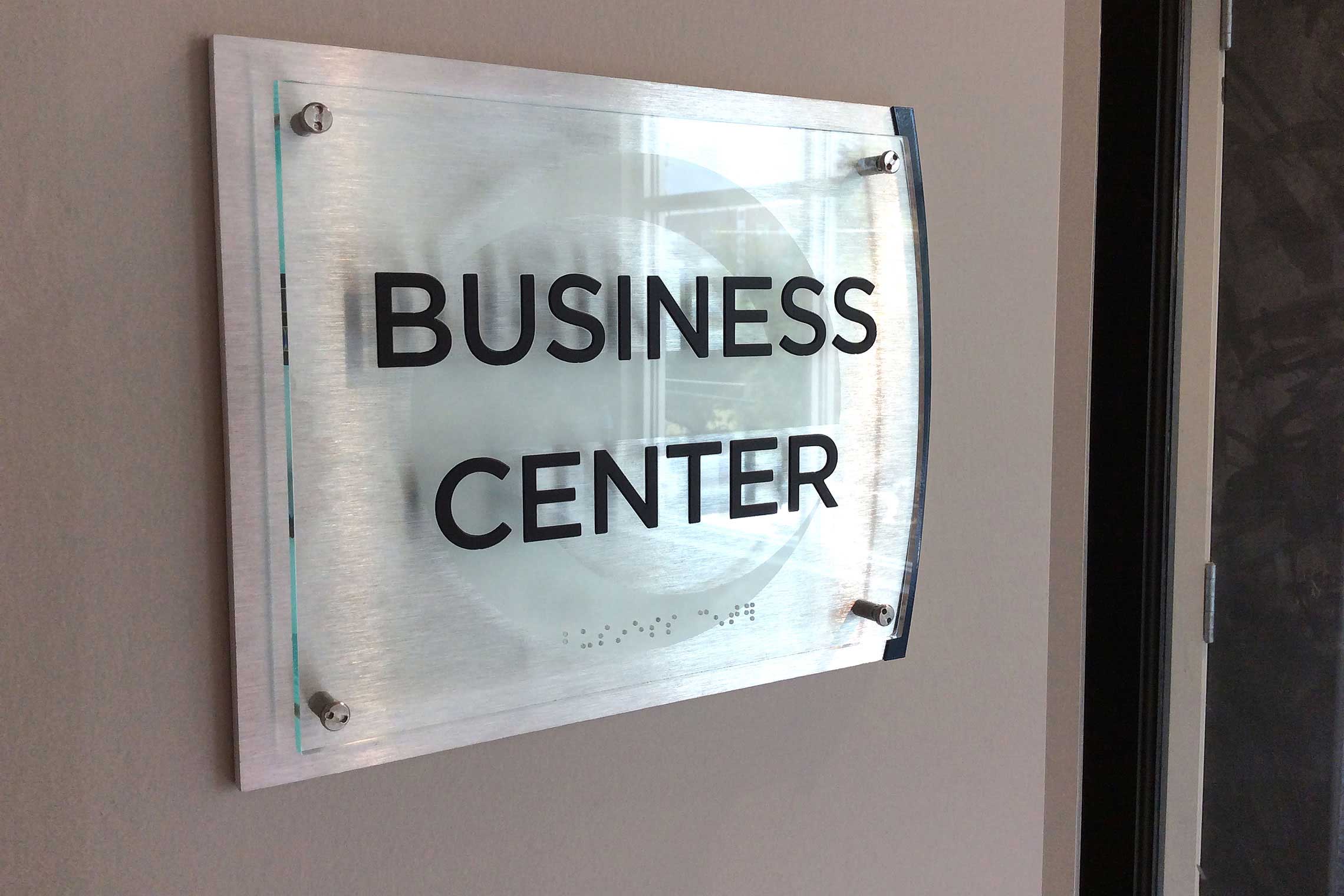
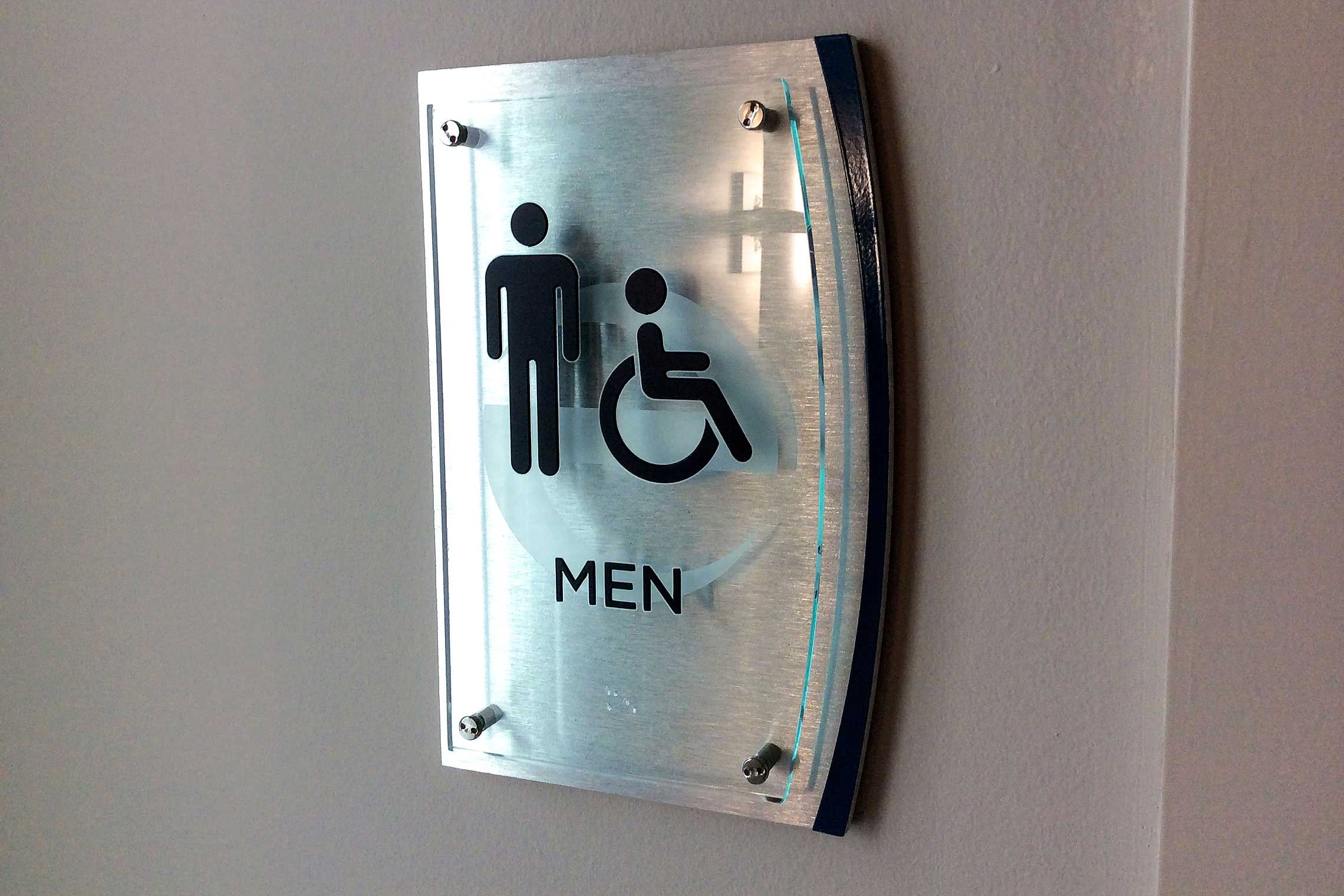
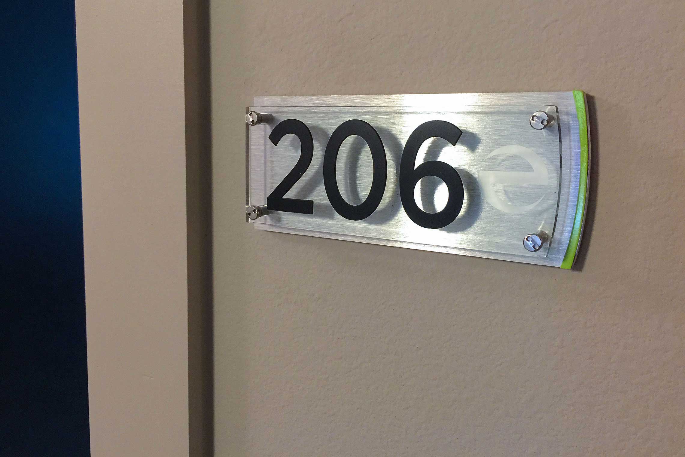
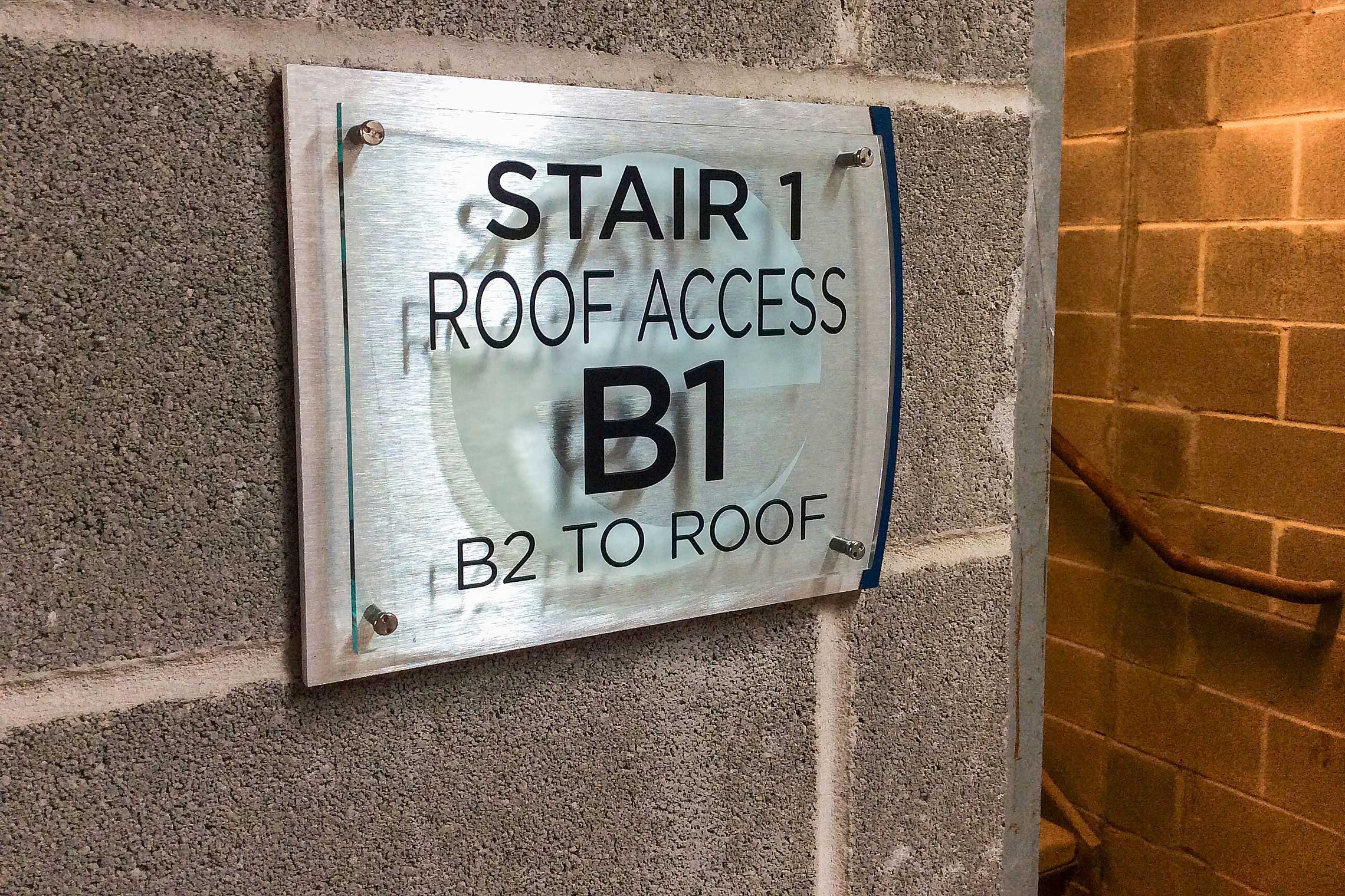
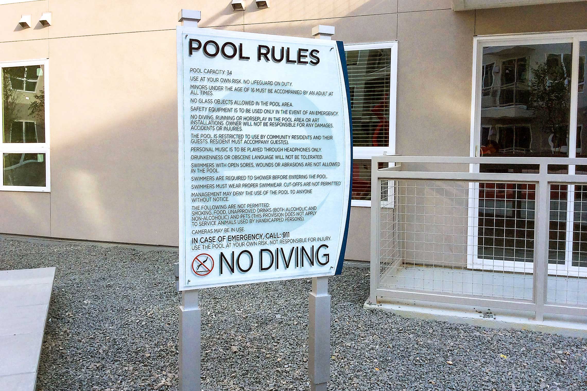
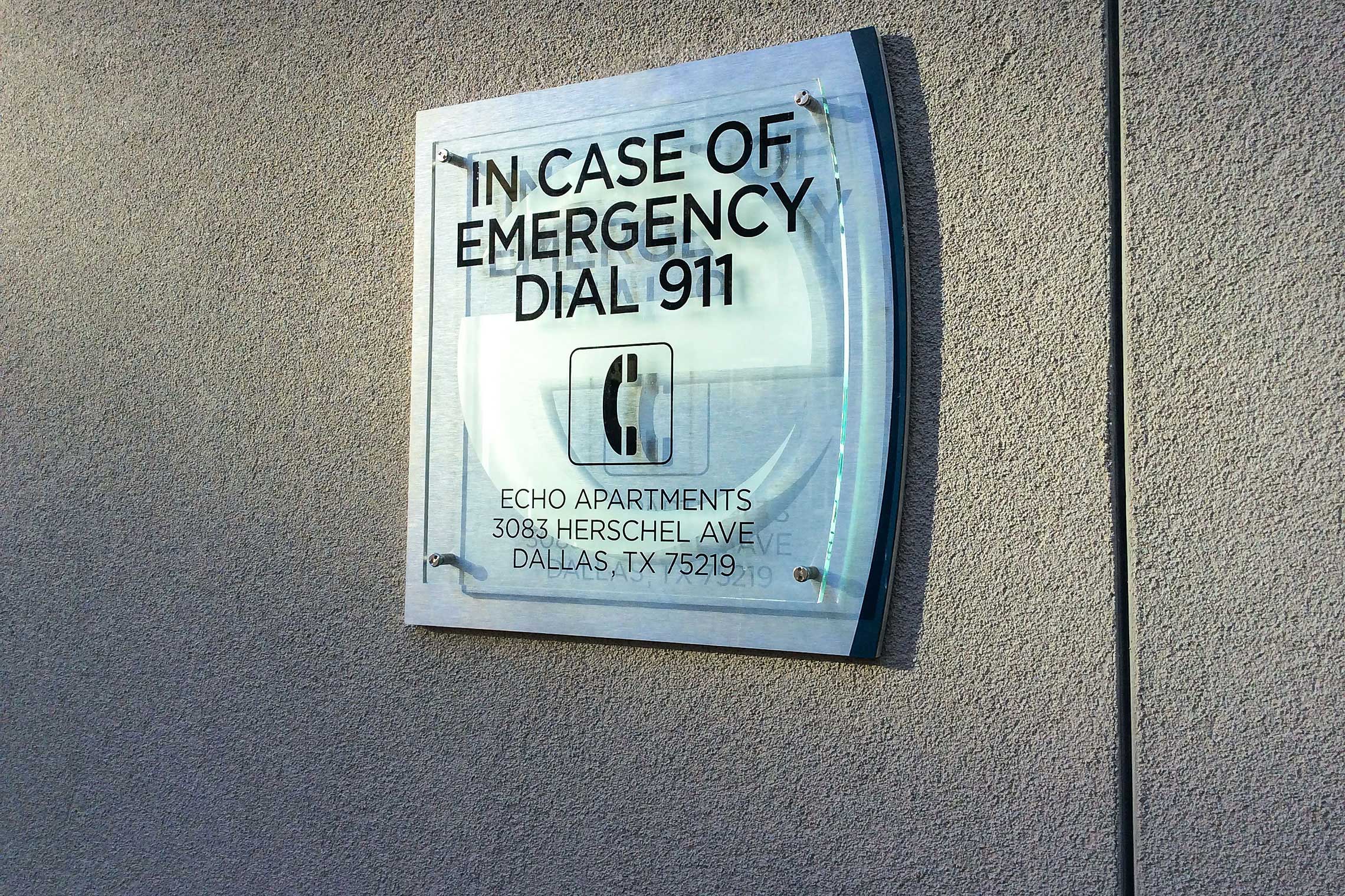
This community bookends the property with two striking identities. Other illuminated signage includes a one-of-a-kind 20’ “e” icon, two parking directionals, leasing center, garage parking, interior garage “e” and tollway frontage I.D. Robinson establishes a prospect corridor easily guiding to potential residents. Community signs reflect the established identity with 1/4” brushed aluminum with thick Coca-Cola etched acrylic and nickel standoffs.


