Robinson Creative Revolutionizes Existing Elements.
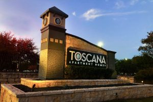
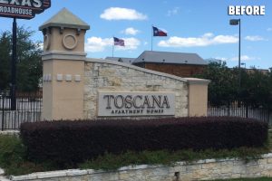
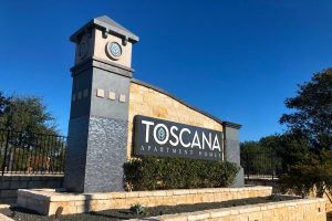
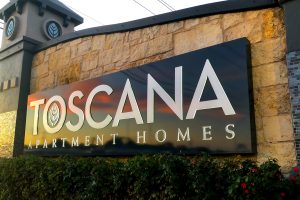
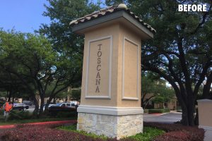
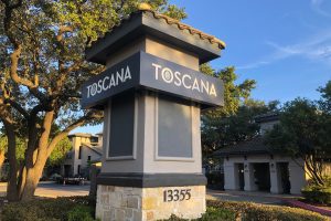
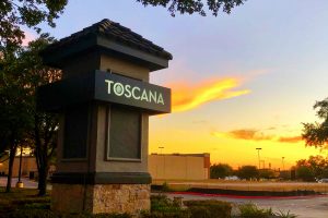
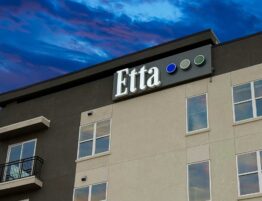
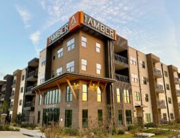
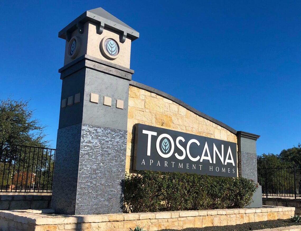
Robinson uses the existing elements in this community’s identity and completely revolutionizes its look! The massive monument was too expensive to replace and its superior location adjacent to the freeway was extraordinary. However, the sign was dated, bland and did not stand out in a very busy landscape. First, the name wasn’t changing so the design team infuses new life into the logo. Colors are established for the new brand with impressive accent materials, like metallic graphite tiles. The mammoth sign is transformed with color, life, and a new upscale direction. The tower becomes a beacon demanding attention while the logo, now in dimensional letters, lifts off the stone structure on an illuminated plaque.
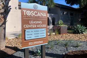
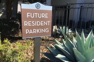
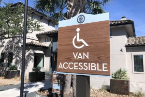
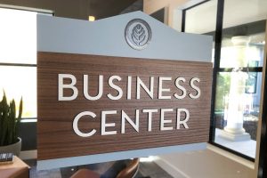
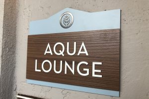
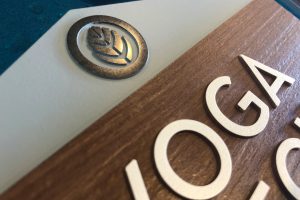
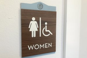
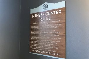
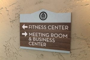
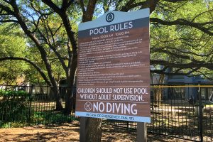
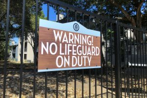
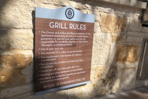
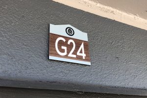
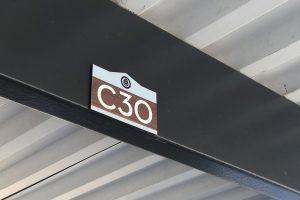
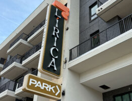
Because the community is located within a retail development, a large tower marking the entrance was also re-imagined with an impressive collar identity. Inspired by the natural agave landscape and walnut elements throughout the restored interiors, community signs are detailed with a faux walnut textured front panel, raised text, and metallic signature leaf icon arranged on an agave apex panel. Signs continue the brand throughout the community by combining interior with exterior elements for solid appeal. This upscale style celebrates the community’s stunning new look.

