What are the secrets to creating YOUR brand?
In this compelling series, we will divulge the secrets of establishing your brand and the 6 essential components that build your image.
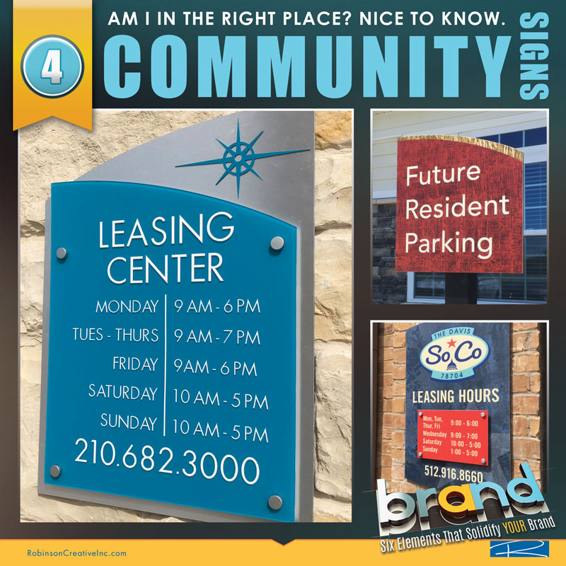
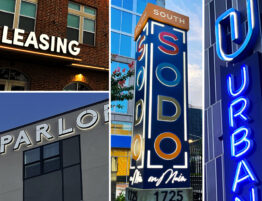
4. COMMUNITY SIGNS:
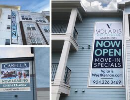
SIGNAGE is a necessity in multifamily, mixed-use or, honestly, ANY development… large or small.
In fact, most signs are required by the city, the American Disability Act, Fire Marshal or a host of others. Add to this, the development’s desire to guide and provide important information to guests, residents, and prospects. It can become overwhelming. However, signs are also a fantastic opportunity to spread your brand throughout the development. Since we previously discussed identity signs, we will cover other types within a project. Let’s first establish the two types of developments, as they require different types of signage.
Do You Have A Type?
Urban:
Usually, a city community (or infill property) that is enclosed, has a multi-vehicular garage beneath or somewhere on site, and could be a mid-rise or hi-rise development. These occasionally can be in the suburbs, but in many cases, are located where space is tight or land is at a premium.
They require additional code signs due to their enclosed nature. Emergency vehicles & personnel, as well as handicapped individuals, must access the community. So, enclosed stairwells require identity and interior level identity. These signs must be ADA (Americans with Disabilities Act) approved with Braille and usually require a certain sized letter and placement. In addition, every elevator must be addressed with signage showing a stairwell exit route in case of fire. Any publicly accessed space must also be ADA/Braille. In order for emergency personnel to locate a unit, hall directionals are required and a site directory is recommended if not required. These mandatory signs usually increase the budget of any urban development, as they are additional to the typical sign needs. Some of these developments could also have a retail and/or office component, adding to a long list of signage.
Garden:
This refers to properties that are normally in the suburban areas. They consist of a non-connected group of buildings. There is a clubhouse/office located in the front of the community and buildings are arranged around. Amenity areas could be located inside the club or be a separate building. These communities have at least one pool and possibly more, depending on the size of the property. Because the community is somewhat spread out, you may find other amenities scattered throughout such as dog parks, laundry facilities, sports courts, volleyball, tennis courts, playgrounds, etc… These types of developments demand building or address signs, depending on codes, to identify each building. They also may need units contained as a separate sign or be included in the building signs. There are fewer signs in a garden community compared to urban “infill” developments, as there are no enclosed stairwells or elevators. Buildings are usually open and do not need hallway directionals. Any publicly accessed area such as bathrooms and amenity areas (Fitness, business center, etc.) must be ADA/Braille. Some codes require a site map near an entrance for emergency vehicles.
Occasionally, a development may be considered a Hybrid. This is a combination of garden and urban types where a community may have a garage and/or building that is enclosed, surrounded by garden-styled buildings.
Find Your Way!
As mentioned, certain signs are a requirement while others are a convenience to your guests and residents. Most of them fall into informational or wayfinding.
The SEGD (The Society for Experiential Graphic Design) defines Wayfinding as…
“Wayfinding refers to information systems that guide people through a physical environment and enhance their understanding and experience of the space.”
Wayfinding informs people of their surroundings in a sometimes, unfamiliar environment. The objective is to illuminate information at strategic points and guide people into the right directions. Visitors may be confused by unacquainted situations. Wayfinding uses simple and direct messages with directionals to stimulate orientation and navigation.
Designers are knowledgeable on the proper placement and installation of signs. In other words, designers know the best location for the sign, where people are more likely to see it, the most visible fonts, which material fares best in harsh weather, and are educated on city sign codes and regulations.
Deconstructing the Monster!
Here is how Robinson Creative looks at signage. Code required signs, of course, are always a priority. So, we research first ever-changing area codes. Right off the bat, signs that fall into code are addresses, building identification, public accessed rooms & bathrooms, unit numbers, and pool signage. Again, add required hall directional, elevator and stairwell signage if an urban project.
Entrepreneur.com says…
“Many cities and suburbs have sign ordinances that restrict the size, location, and sometimes the lighting and type of sign used.”
Then we look at rule signs. These include many of the amenities like pool, fitness, business center, etc… Pool Rules are required but other rule signs are highly recommended due to liability issues. For example, if rules are clearly seen and someone gets injured, posted rules stating the resident is responsible and not the management, protect you! Clear amenity guidelines should always be posted.
We also look at the prospect tour path. You may want to spend a little more on these signs within this path, as they are what your prospect sees during their first visit. They are a reflection of who you are and are a first impression. Cheap, gaudy signs may project a negative image and management style. These include the future resident parking, hours, any clubhouse/office signage, interior, and exterior amenities, and unit signs. If the budget is tight, spend less money on signs, not on the tour path or pedestrian level. For example, building signs can be quality-made without being over-the-top expensive because they are 25’ up in the air.
Robinson Creative promises professional sign designs that are eye-catching and guarantees optimum placement to generate more traffic, while always making sure to adhere to all city regulations. RC also commits to supervise every sign installation to ensure the signs are properly installed.
8 Simple Sign Tips!
-
- Know Materials Drive Cost
- Always Keep Them Brand Consistent
- Establish A Reasonable Budget for Lasting Signs
- Pedestrian-Level Signs Should Be Nice
- Invest In Rules Signs To Protect You
- Hire Trusted Professionals That KNOW Codes & Restrictions
- Signs Should Contrast Not Blend
- Always Maintain Signage
A signage campaign can get expensive, especially if you are establishing a complete development. Make sure you budget properly. A typical 230-unit community can have over 1,000 signs (not including monument or identity). Think about it. If we take our 230-unit example, one-fourth of the signs are the units alone… Add to this – multiple storage units, garages or carports, etc. Remember, a large number of signs are code required; you cannot eliminate them! Sometimes, a city demands larger building signs with units contained. They also may require a sign on each side that faces a fire lane, which could be up to three signs per building. If you have 10 buildings, that’s 30 building signs! Also, think about materials: You must have signs, but materials are the driving cost factor. A 3-level, ¼” brushed aluminum with routed acrylic face and stand-offs is a more expensive sign than a high-density laminated single-layer.
One thing we find amusing is that most clients are not excited about signs; they want them to blend into buildings, having the same colors. Unfortunately, if signs are not contrasting colors, people will not see them! Signage should be consistent with your brand, work with exterior and interior colors, but NOT blend! You want them to do their job, so they must be seen. Women understand this analogy…
“They are like accessories in a great outfit. Your community is the outfit; signs should not only accentuate the community but also stand-out from it to be most effective.”
Finally, maintain your signs! Always look at signs when walking the property. Kids tend to have fun vandalizing them – pulling letters off or graffiti. Ensure sprinkler heads are not directed at signs, as it will cause staining and deterioration. Have maintenance wash-off signs regularly from dirt and grime. Replace them when needed. Remember, they are a reflection of your management style!
It’s All About Who You Are!
Signs are taking your colors, theme, and brand, and then reproducing it throughout the community in every application. As you guide and inform with signs, it is the perfect opportunity to secure your image. The consumer is introduced to your property at the street level with your identity, (monument or building I.D.) but your community signs should reinforce that identity. Every time they look at a unit sign, rule, or amenity, they see who you are. Signs are simply taking advantage of a necessity or required element!
It makes the community more memorable if everything connects. So, don’t forget COMMUNITY SIGNS are a part of the whole image! Browse through some of our sign campaigns in the Work section of the website to see some fantastic branding examples.
Continue to Number 5: Essential 6: Marketing!


