What are the secrets to creating YOUR brand?
In this compelling series, we will divulge the secrets of establishing your brand and the 6 essential components that build your image.
2. BROCHURE:
In this digital world, is a brochure still necessary?
Our answer… a resounding YES!
Websites are a fantastic method for information. It is an easy way for clients to see photos, gain more insight, and possibly download plans and info about your community or business. However, most clients will eventually want to see the actual product, speak with someone and get a better visual. Let’s face it… People (and businesses) lie on the Internet. Our trust wanes after years of pretty words and PhotoShopped images. More and more, the public is cynical and grows weary of the Internet’s promises.
A website is convenient and a MUST. But there’s nothing like personal interaction, a consultant’s smile, experiencing a community’s warmth, picturing yourself there, walking through your future home, and after… being handed a printed brochure that encapsulates that experience.
A brochure is all about story. It is a tactile representation of the community using stunning visuals, information, and textures. It tells your unique story and becomes a “thank you” gift at the end of the experience. It should reflect your attitude, theme, and brand as well as connect back to the website, your identity, and other elements.
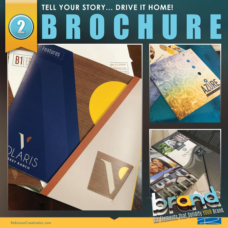
We’ve seen expensive communities expect high-price rents from potential clients, only to give the client one photocopy of a floorplan when the tour is over. This tells that customer you don’t care about them. Your community spent money on the amenities, the interior finishes, and the best staff. However, if you only hand them a B/W print, the prospect is thinking, “What will it be like living here if they can’t even give me a nice brochure?” It broadcasts the wrong message. Also, what if your competitor has an inferior product but actually hands a client a thoughtful brochure? When the prospect gets home and they compare what they’ve seen, do you think your Xerox copy will compare to a competitor’s stylish brochure? A brochure recharges their memory of the tour and community with visuals, story, and brand.
A photocopy does nothing for your brand! You’ve missed an opportunity to reinforce your image and, in the process, may have damaged their perception.
Many think if they spend money on a website, they don’t need a brochure. Our suggestion is to go a more creative route. Spread the funds to include a collateral piece, but be frugal so you get the best-branded brochure possible. Supplement that piece with follow-up materials and printed promo materials. Encourage your staff to keep accurate records of potential clients. After your first interaction, send them an email or place a call to thank them. Also, send them a personalized note as a follow-up! In a world where competitors only have a website, it underlines the prospect’s importance to you. They feel appreciated. And… it continues the same magic the brochure started.
Still, think we are pulling a fast one because we want to design and print your next brochure? See what Forbes says in the article, “Paper Beats Digital.”
“Marketers should take advantage of the unique properties of both paper and digital. In particular, print advertising can maximize sensory appeal. Print offers the ability to deliver rich, vivid images along with tactile stimuli. In some cases, scent can be used to further increase print’s impact.” – Forbes
In a nutshell, we utilize the Internet to scan and search, but to remember it, we still hit PRINT for the most important elements. Printed material engages at least two senses… both sight and touch. Science has proven printed material to be more recognized by our brains as something real and substantive. Digital is dynamic at first but often forgotten.
What A What Brochure Should Be:
- Continues the Brand Message with Colors, Logo and Theme
- Presents Clear, Memorable and Simplified Information (Don’t Bore Your Clients With Too Much Info or Adjectives!)
- Tells A Story! What Makes You Different?
- Uses Professional & Dynamic Images (No Cell Phone Snapshots!)
- Showcases Clear Readable Floorplans
- Utilizes Textures or Multiple Papers to Ignite the Tactile Experience
- Brochures Are A Tool/Train Staff on How to Implement
- Matches The Character of the Community (Nice Community? Nice Brochure… No Photocopies Allowed!)
Finally…
In multifamily, the number of marketed floorplans will decide the size and breadth of your collateral piece. You want your plans to be seen. If they are too small, the prospect will find it difficult to not only see them but also picture their furniture fitting! Find a layout or format that properly showcases your most important assets. For example, you will not do a simple tri-panel if you have 16 plans. They will be much too small! You will need a larger booklet, fold-out or even pocket with inserts.
Don’t skimp on this or your printed brochure will become useless. If you have a larger number of plans, try two plans per page in a booklet or limit your inserts to under three “like” plans per page, so that your customer isn’t overwhelmed.
Many new construction properties now have up to 40 plans. A brochure should assist staff in organizing plans. Pre-qualify the prospect so that they are shown specific plans that pertain to their needs.
Even though Robinson Creative establishes custom brochure designs for clients, another option is the innovative Design Print Studio. When budget is a factor, consider this templated, inexpensive alternative. DPS is a print-on-demand system offering creative themes at a reduced price. Several brochure or insert options are available with supported print marketing.
Read more about brochures and their importance in the digital age:
Why Brochures Are Important For Marketing
The Importance of Brochure Printing As a Marketing Tool
Check out Part 1: IDENTITY
Continue to Number 3: Essential 6: Digital!




Write a comment: