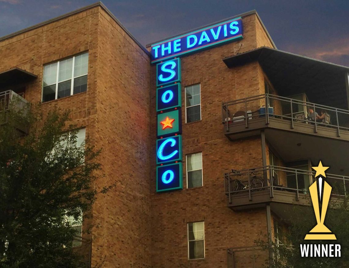
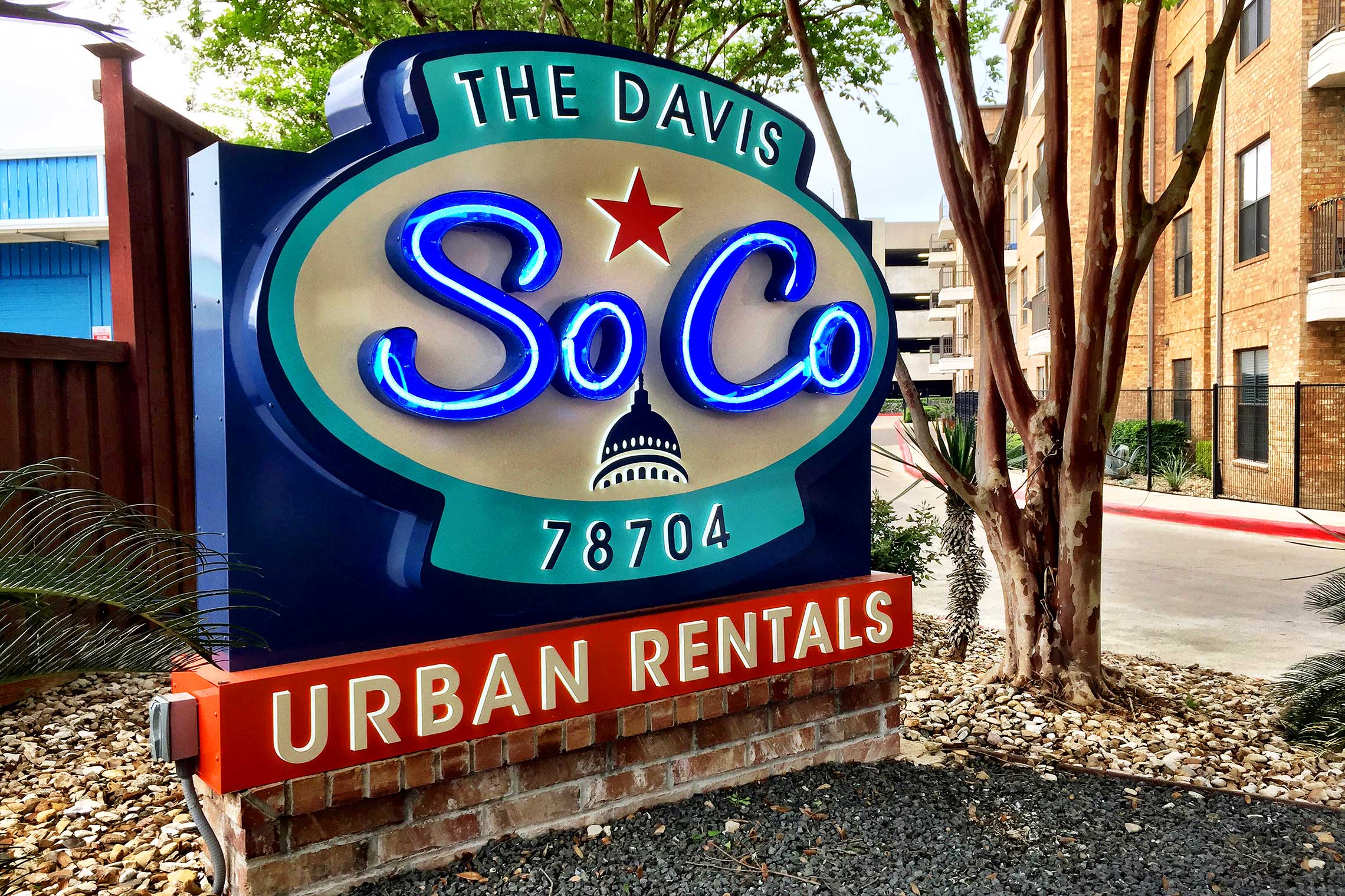
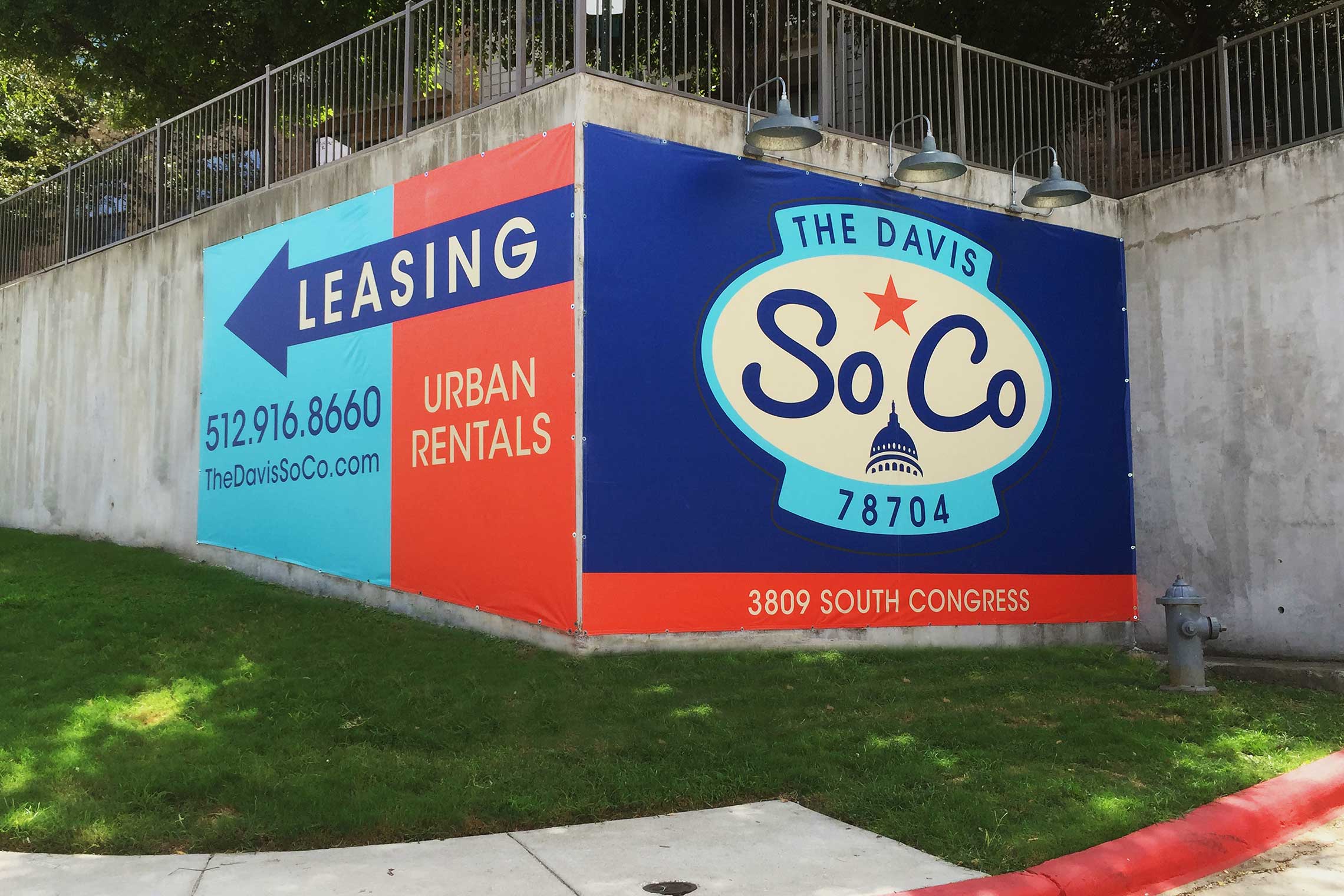
A Retro-Inspired Repositioned Community.
This ten-year-old community requires a reface and new brand along with their interior unit updates. The area embraces an alternative approach with food trucks, eclectic retail, and hip, funky dives. Most of the surrounding shops embrace a neon vibe. It seems appropriate that the community also takes advantage of this attitude.
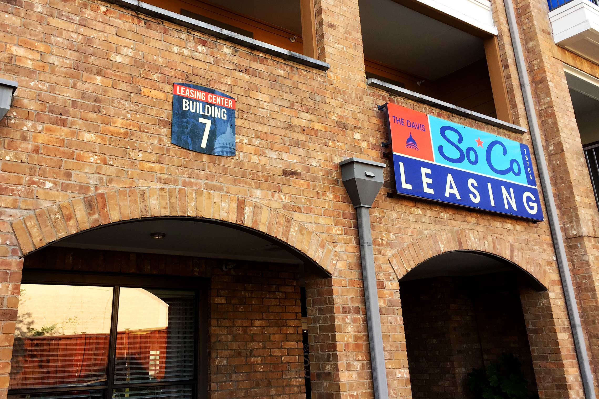
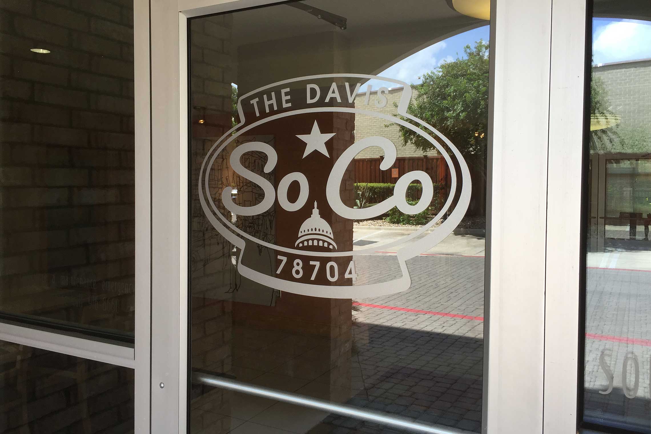
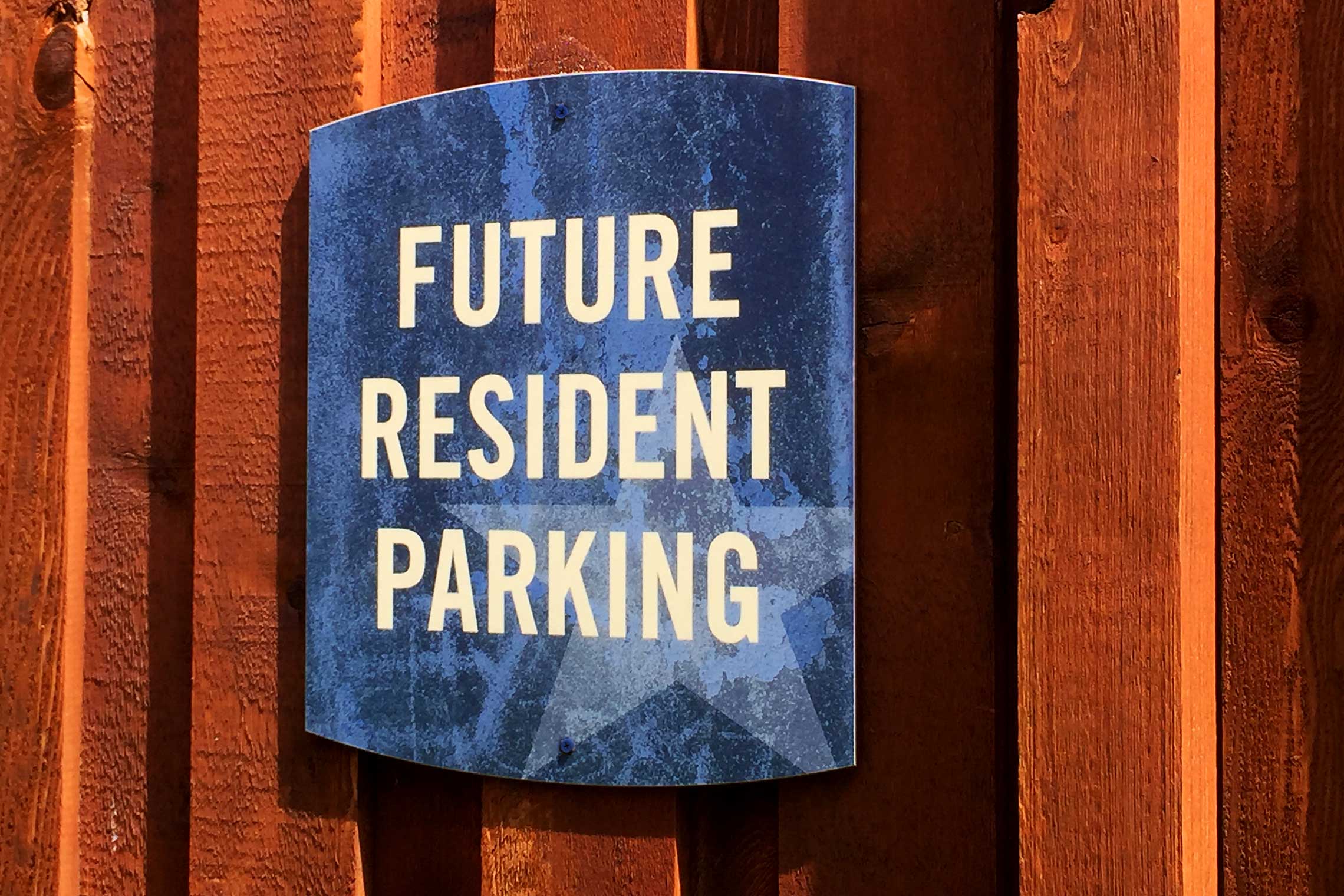
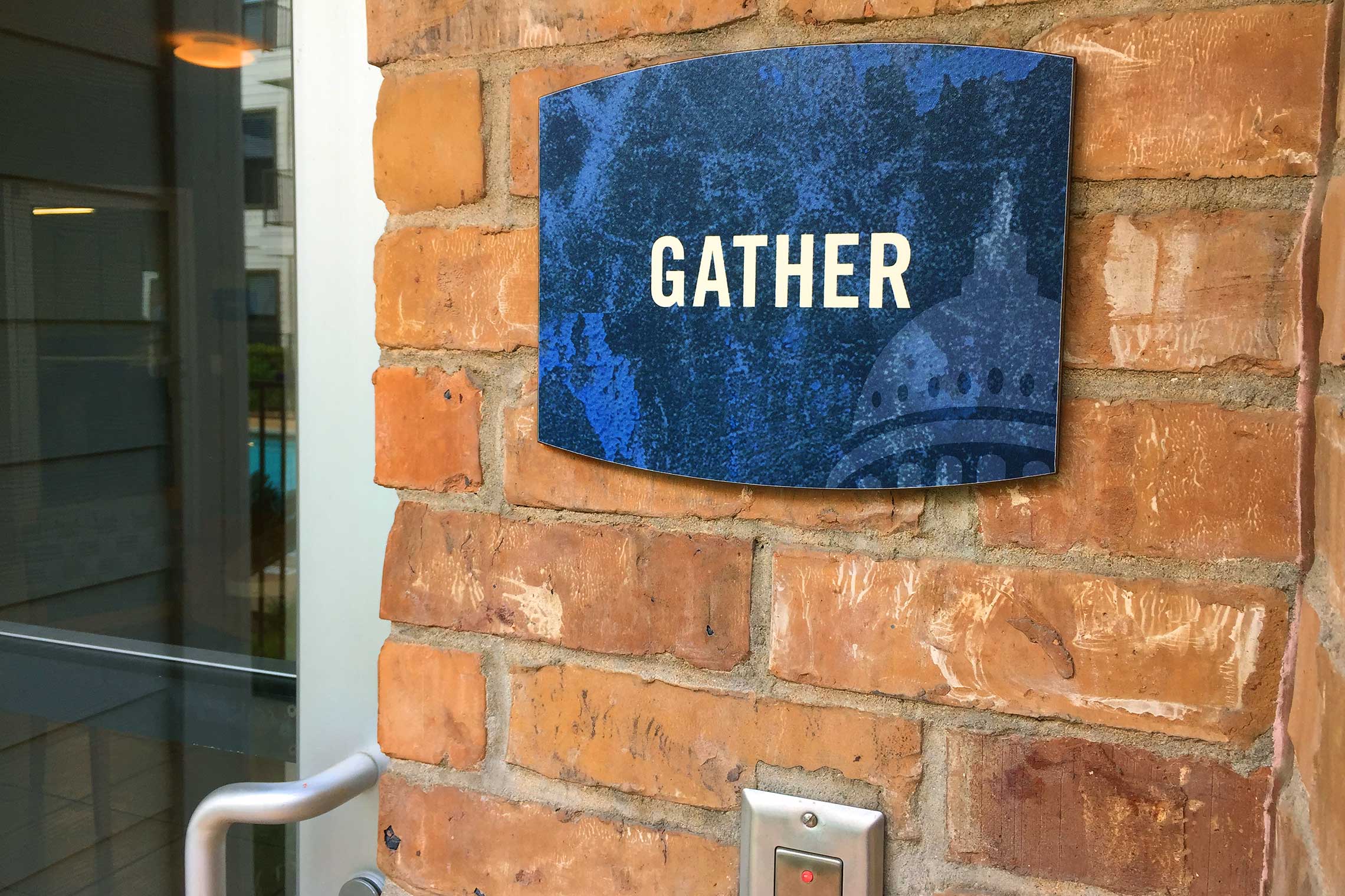
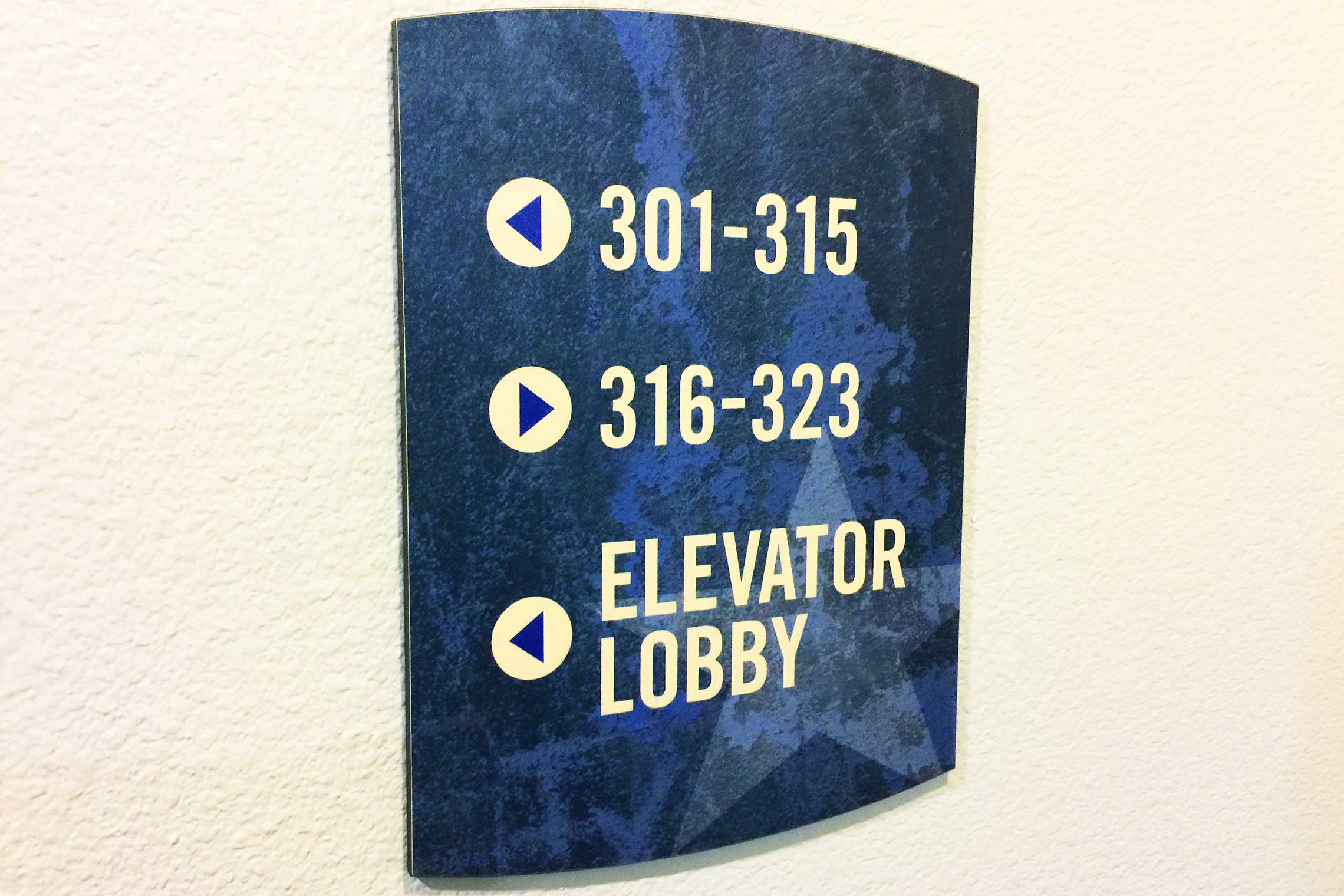
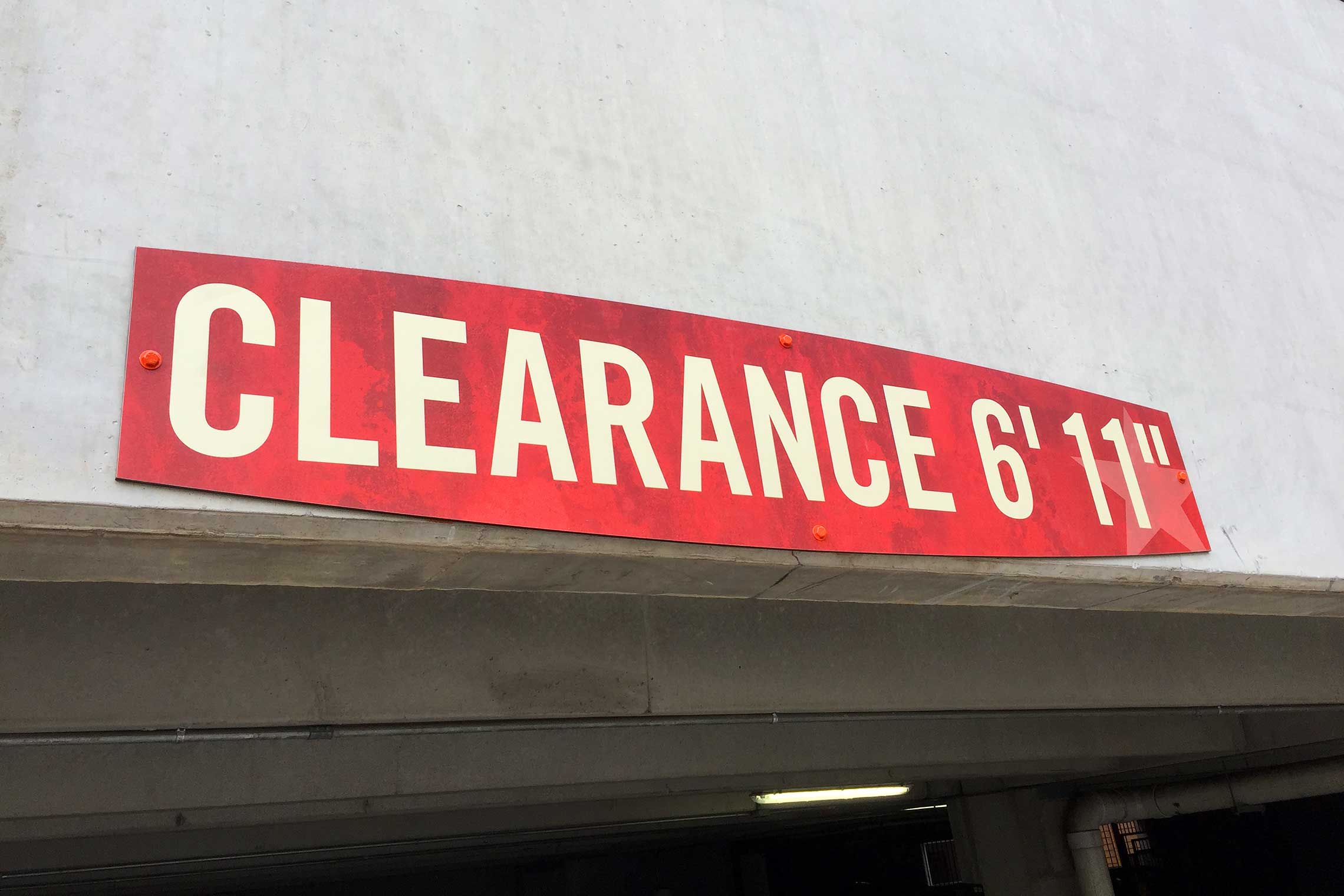
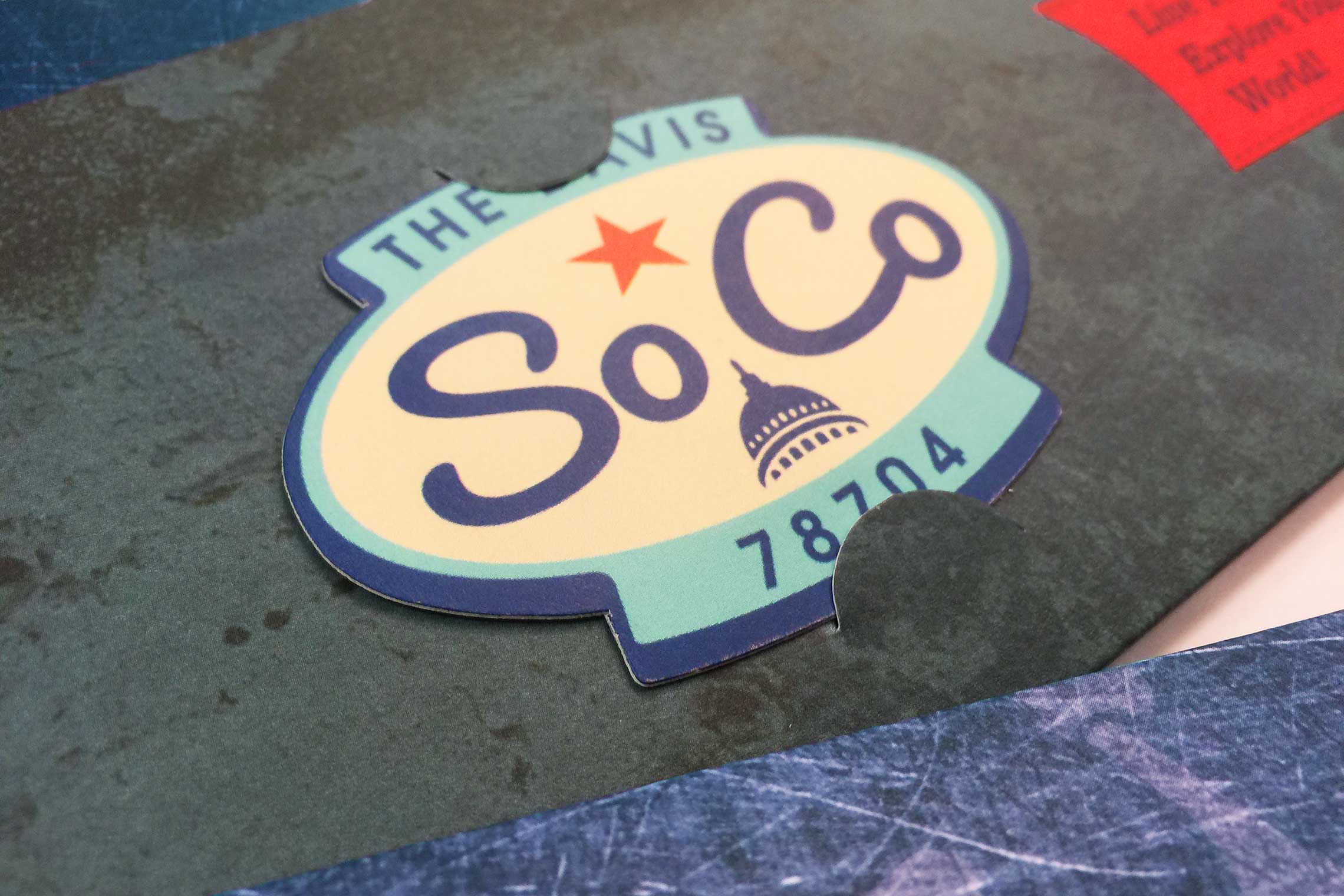
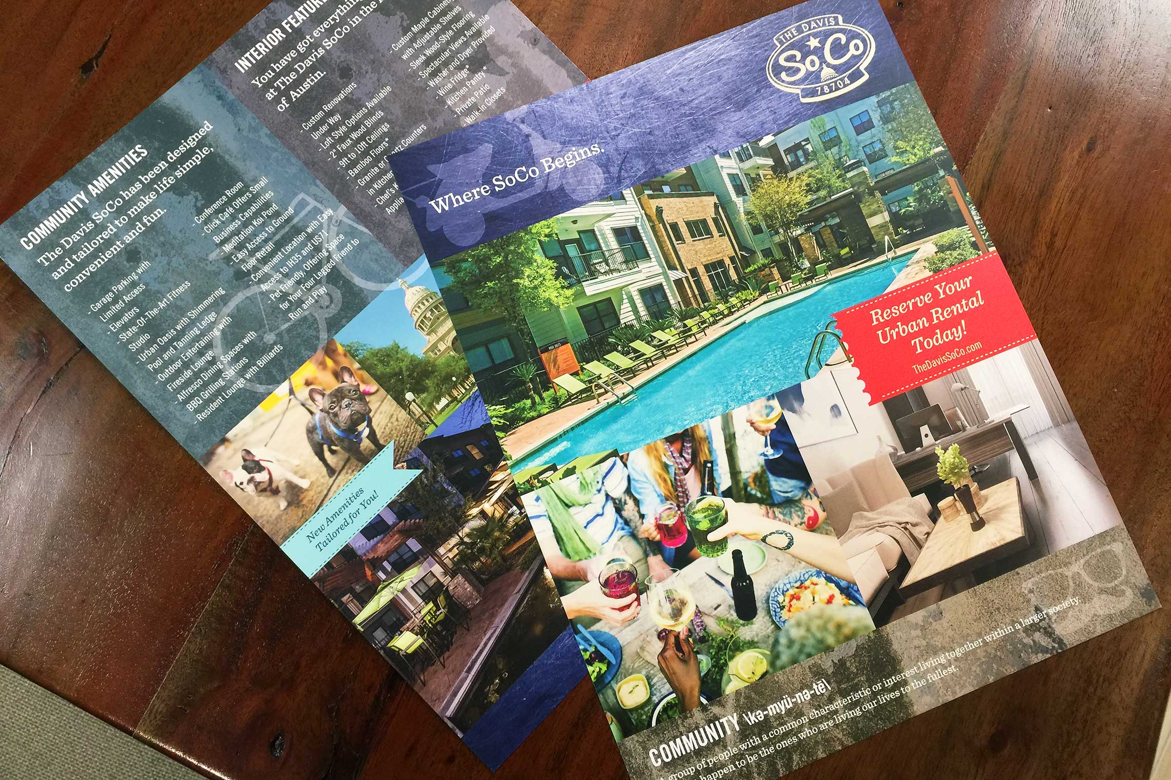
Branding is infused with by-gone colorations, shapes, and iconic symbols. Utilizing the street frontage and front loft-style building with retail, The Davis SoCo features two, nearly 30’ high, neon building identities. This vintage, but stimulating approach to mixed-use residential now makes an impact on South Congress in Austin. It includes temporary graphics, identity, full community signage, print and other services.
The revolutionary campaign just earned two Communicator Awards!

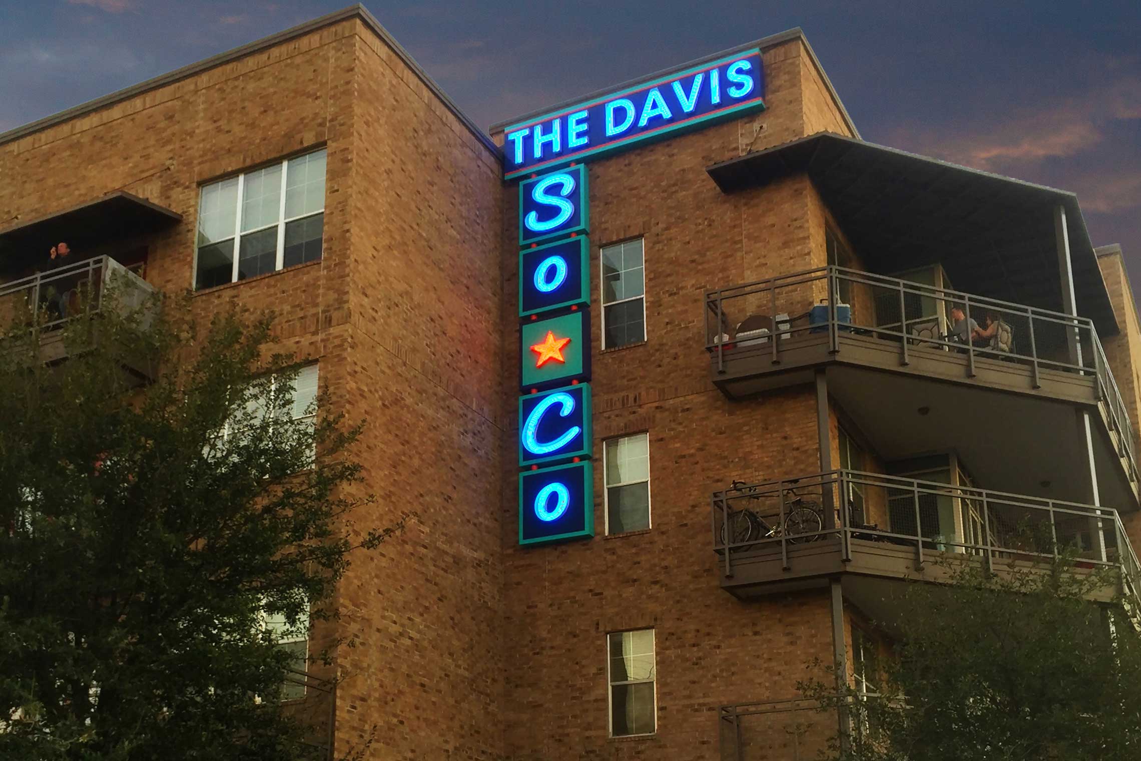
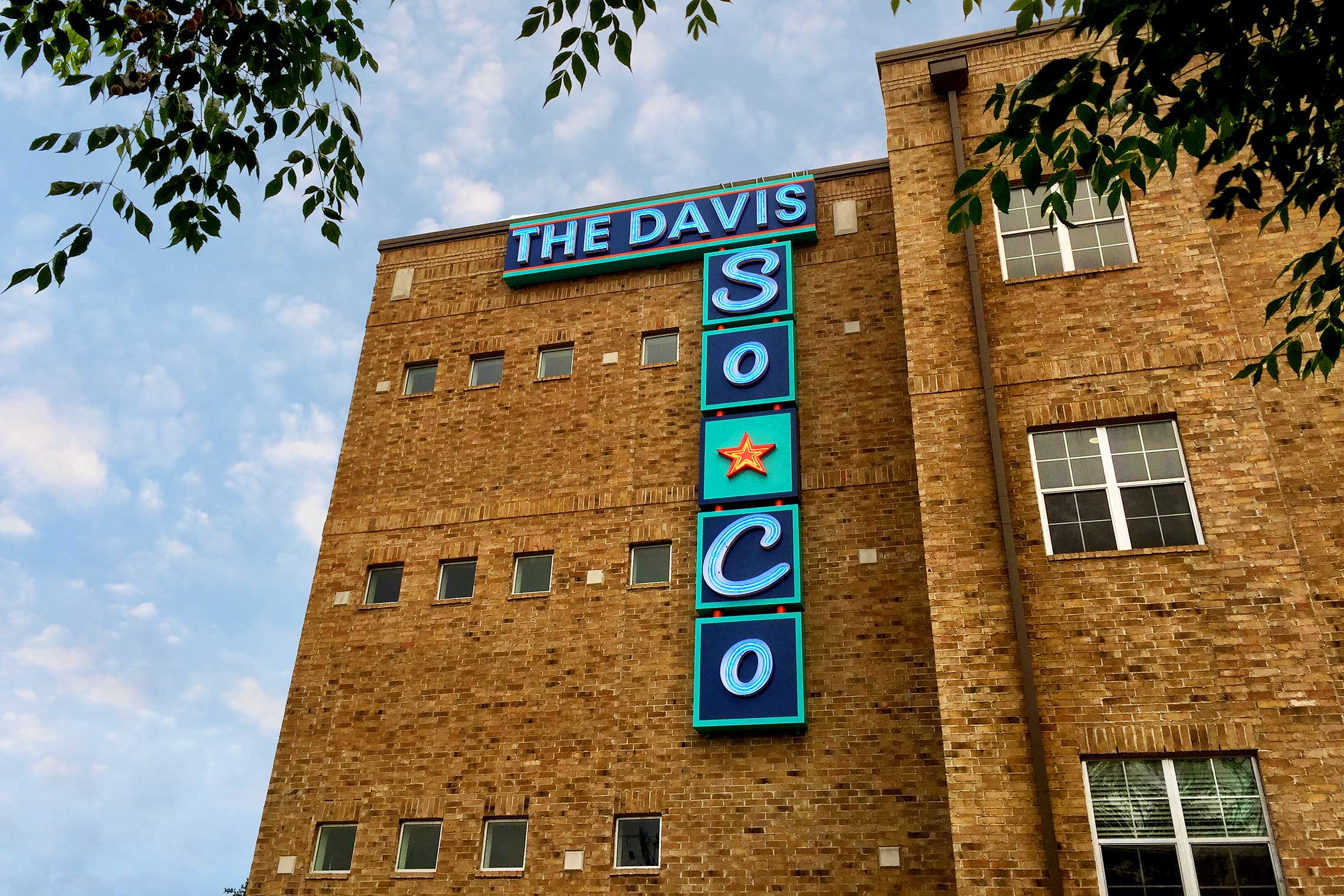


The Davis SoCo
