Mixed Messages.
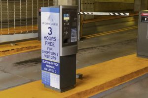
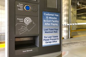
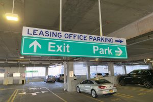
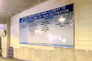
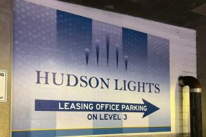
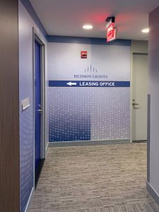
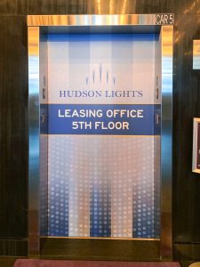
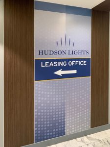
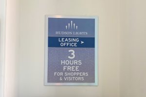
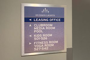
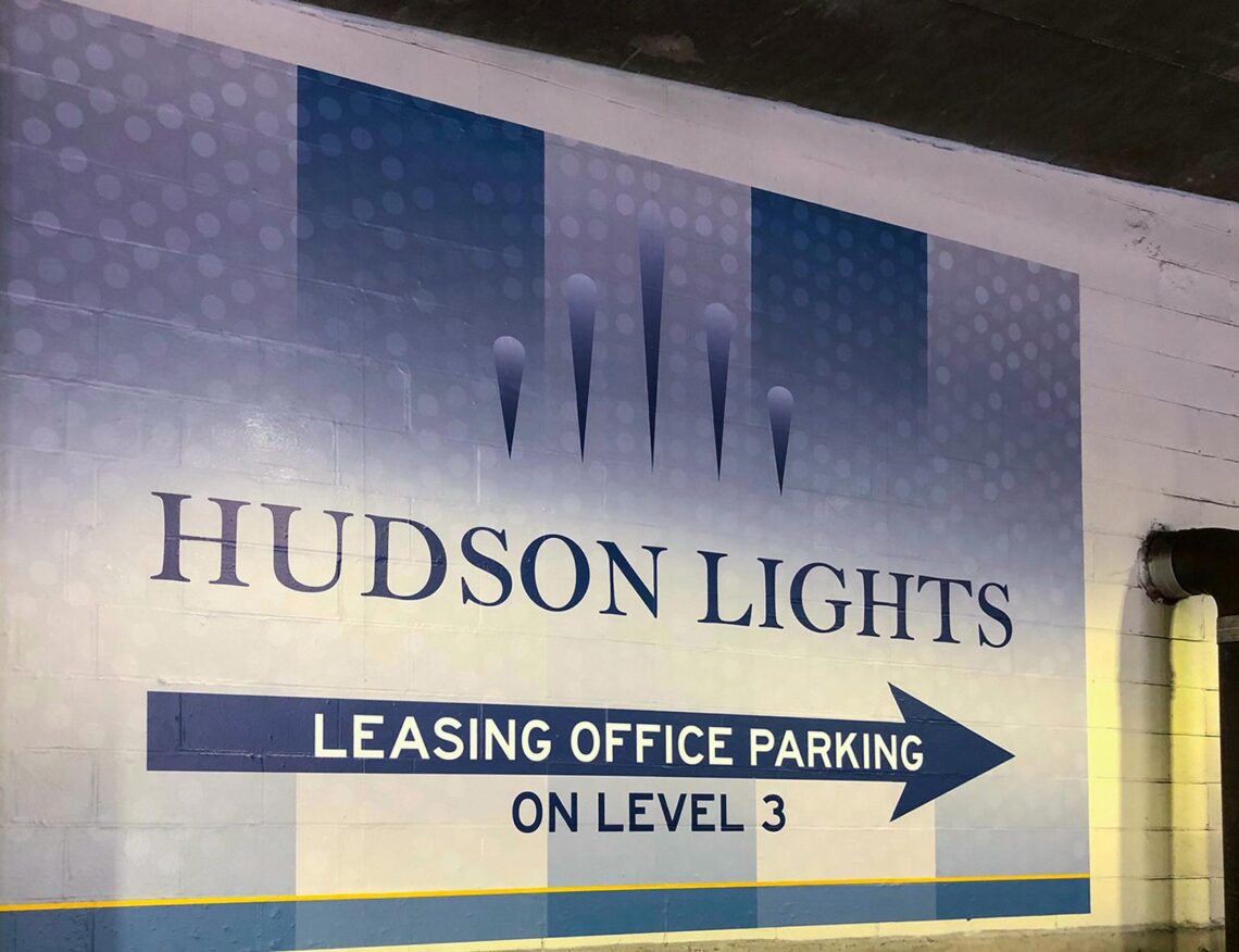
Hudson Lights, just outside of NYC, is a mixed-use development featuring hi-rise residential, retail, restaurants, and an iPic Cinema. Like many urban properties, Hudson Lights is designed around a complex garage. The challenge is to provide parking for retail and residents as well as illuminating the path for the prospect. With so many options, a garage becomes confusing and, in this case, prospects must be guided to a specific area, elevator, and pathway to the leasing office.
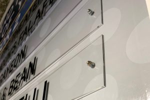
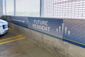
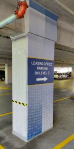
A new overall brand is established with stylistic and memorable graphics. Colors are utilized for both garage and interior building, continuing the brand. With expansive garage cement wraps, bold interior wall graphics, shopping directories in key areas and elegantly updated, double-layered identity signage, each group is easily directed without confusion. Strategically placed graphics allow prospective residents a clear directive with NO mixed messages.


